 Absentee voting has already begun in Nebraska. And it turns out there are more names on the ballot than just the presidential candidates. If you live in Nebraska’s 2nd congressional district then you also get to vote for your representative to the US House! Nate Silver’s FiveThirtyEight polls-only forecast has the district as a dead heat between presidential candidates Hillary Clinton and Donald Trump which could translate to a contested race for the House. Below I have some SparkNotes™ from the congressional debate so all of us in NE02 can get informed together. But first some formalities: Brad Ashford was elected to represent the NE02 in 2014, the first Democrat to hold the seat since 1995. Before that he served in Nebraska Unicameral (District 20) from 1987-1994 and from 2006-2015. You can read more about Brad Ashford at Ballotpedia or on his campaign website. Don Bacon is a retired US Air Force brigadier general from Papillion. He is currently an assistant professor in leadership at Bellevue University. You can read more about Don Bacon at Ballotpedia or on his campaign website. You can watch the debate and read the transcript on CSPAN here. Some questions below only have answers from one candidate; those are questions that they asked each other (how cute). The notes get longer as the debate progresses as the candidates begin having more of an open dialogue. 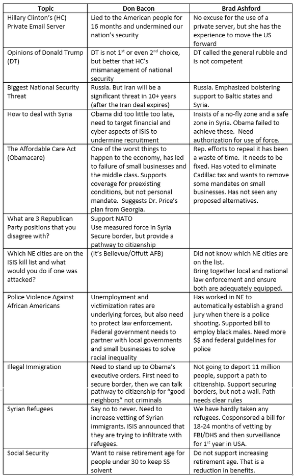 Some final thoughts: Mike’l Severe and Craig Nigrelli did an excellent job of moderating this (amazingly) civilized debate. Don clearly had some talking points that he wanted to squeeze in that took him off topic on occasion. Brad was very polished at the beginning of the debate, but while he maintained his substance, he lost some of that polish later on. Brad also thanked Don for his service on multiple occasions while Don attacked Brad as a career politician while he himself was an outsider. Obviously this is not comprehensive and I would encourage you to look further into these candidates, but if you do not have time I hope this helped to inform your decision. Or it did not and you are still going to vote along party lines. That’s cool too just don’t forget to register to vote!
Online voter registration in NE ends at 5:00pm on October 21st. You can register here.
1 Comment
It’s possible to find play-by-play win probability graphs for every NFL game, but that does not tell me much about how the game itself was played. Additionally, I only sporadically have time to actually WATCH a game so using play-by-play data, R, and Inkscape I threw together this visualization of every play in this past Sunday’s game between the Kansas City Chiefs and New Orleans Saints. Why isn’t this done more often? 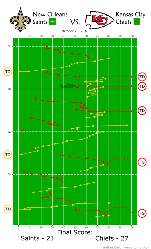 Podcasts are a big thing right now. They are perfect for commutes, washing dishes, long walks on the beach, whatever. Podcasts are a huge part of my day now. Serial (season 1 at least) changed the podcasting landscape and now they are everywhere. There are so many great choices, maybe too many, are we in a podcast bubble? Who cares. I get as many podcasts as I want, all for free.
On a recent episode of Question of the Day (a podcast of course) the hosts were discussing the future of podcasting. One of the co-hosts, James Altucher, posited that “it is worthwhile to do a podcast or to do an oral history...and the equipment is there.” He goes on to talk about how he records podcasts on his iPhone just for fun and uploads them “wherever.” This topic reemerged in a later episode on how to be an interesting person. The key, they agreed, was to ask interesting questions. Well I have an iPhone and I want to be an interesting person. So i looked into what it takes to make a podcast and what I found was alarming. It is so simple. Contributing to the podcast glut I made a podcast and in an effort to make more interesting people I wrote this guide. First a disclaimer: this method actually does cost money. You need to have a cell phone and a computer, but since this is 2016 those hopefully are not insurmountable obstacles. I will be using my iPhone as an example but the process should be generalizable to Android phones etc. First you need to record the audio for your podcast. iPhones come pre-programmed with a voice memo app. Boom. Recording software. You’re basically halfway there. So find someone you want to interview or just write up a script and record it right there on your phone. Next you need to transfer your voice memos to your computer which can be done through iTunes or sent from the app. If you recorded it perfectly the first time and don’t want to add music or effects you can skip this paragraph. For most of you though you will want to filter out some of the noise or splice together various snippets of audio. Audacity is a free, open-source audio editing program that does all of those things. Mac folks could also use GarageBand. Unlike some open-source software (*cough* Gephi *cough*) Audacity is very stable and user-friendly. You may need to download some plugins to import/export certain file extensions, but the program will forward you to the appropriate websites. Audacity has a great tutorial on mixing narration with background music so start there. If you want to try other effects their help wiki is...uh...helpful. I used the noise reduction and compressor effects first to level everything out and then the envelope tool to alter narration and music volume levels. Obviously you should listen to your podcast all the way through before exporting. I chopped out extraneous “uhs” and “ums” as well as any loud breaths. Be careful though because editing out too much can make the interview sound unnatural. After you export your file as an MP3 you need to get it from your computer to the World Wide Web. iTunes does not host the podcast, but rather provides a distribution platform for audio files hosted elsewhere. Audacity has some recommendations for where and how to upload your file on their podcasting tutorial, but I chose a different route and used SoundCloud. You can also choose to host your file for free on Google Drive or WordPress. Soundcloud’s useful creator guide walks through how to use their service and how to get your podcast to iTunes. (NB Make sure the profile picture on your SoundCloud account/podcast files is at least 1400x1400 or iTunes will reject your podcast.) Once your podcast is uploaded to SoundCloud, go to the content tab on the settings page and copy the link for your RSS feed. The last step is submitting your podcast to iTunes, the preeminent podcast repository. iTunes has a great walkthrough regarding the process. You basically just click “Submit a Podcast” from the podcast page of the iTunes store in iTunes, login with your Apple ID, and paste the link to your RSS feed from SoundCloud. Click “Verify” and your podcast is submitted. It may take up to 1 or 2 days for your podcast to appear on the store. Once your podcast is up, you and your friends can download it to your phones, subscribe, anything that you can do with a “real” podcast, because your podcast IS a real podcast. How easy was that? I made my first episode in a day and people were downloading it within 24 hours. For my first podcast I chose to interview my dad about his life and cut the interview into four different “episodes.” I am still not sure if he counts as an interesting person, but it was fun for both of us and I got to practice asking questions. Maybe the best way to become an interesting person is just to tell others that you have a podcast. You can find the podcast I made, “Papa Cam”, here or search for it in the iTunes store. The Department of Pharmacology at Creighton University School of Medicine is small, but mighty. There are only 10 professors or principal investigators (PIs) in the department, but this small size has its advantages. Or at least that is what we tell ourselves. A recent paper in Nature argued that bigger is not always better when it comes to labs and we are putting that to the test. Ideally with a smaller faculty, there would be more collaboration. Everyone knows what everyone else is doing, more or less, so they can more efficiently leverage the various expertise found throughout the department. To measure how interconnected the pharmacology department was I created a network analysis visualization based on who published with whom. Using NCBI’s FLink tool I downloaded a list of the publications in the PubMed database for each PI in the pharmacology department at CU. A quick script in R formatted the authors and created a two-column “edge list” for each author, basically a list of every connection. This was imported into the free, open-sourced network analysis program Gephi which crunched the numbers and produced a stunning map of the connections in the pharmacology dept: 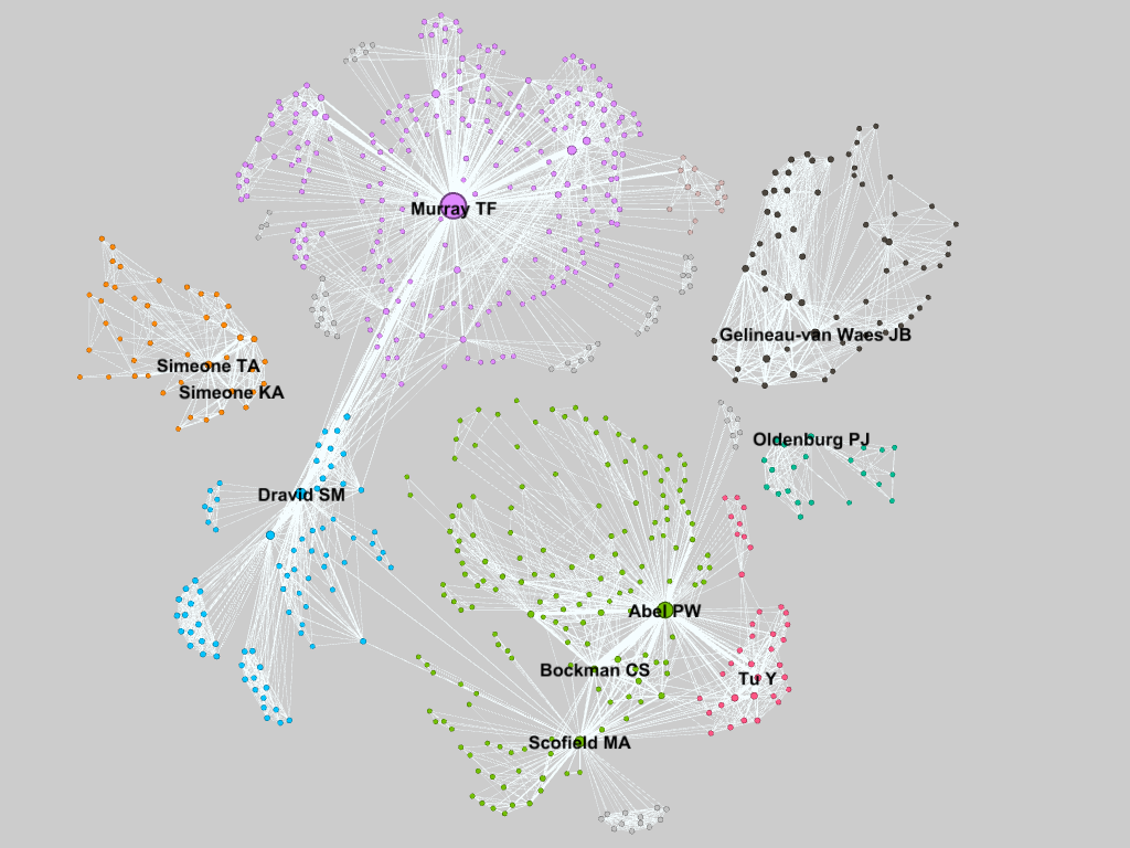 Gephi automatically determines similar clusters (seen as different colors) which are unsurprisingly centered on the various PIs in the department since those are the publications I was looking at. Dr. Murray, the department chair, has the most connections, also known as the highest degree, at 292, followed by Dr. Abel. Drs. Dravid and Scofield are ranked 2nd and 3rd respectively for betweenness centrality, after Dr. Murray. They are the gatekeepers that connect Drs. Abel, Bockman, and Tu to Dr. Murray. Each point’s size is proportional to its eigenvalue centrality, similar to Google’s Pagerank metric of importance. I was a bit surprised at how disperse the department was. 60% of the PIs could be connected, and many have strong relationships. However the rest are floating on their own islands. Dr. Oldenburg is relatively new so this is not surprising. The Simeones (who are married) are closely connected. Also unsurprising. This was a quick and dirty analysis and a few of the finer points slipped through the cracks. Some of the names are common in PubMed (especially Tu). so I did my best to filter what was there and only look at publications affiliated with Creighton. Unfortunately this filters out publications from other institutions by the same author. Also not everyone is attributed the same way on every manuscript. This is especially true for Drs. KA Simeone and Gelineau-Van Waes who have published under different last names, but also because sometimes a middle name is given and sometimes it is omitted. I tried my best to standardize the spellings for each PI, but with over 700 nodes I could not double check every author to ensure there were not duplicates elsewhere. If more than one PI shows up on a paper, that paper may show up under both searches. This should not increase the number of edges, but would affect the “strength” of those connections. The connections are about what I had imagined. The brain people are on one side, everyone else is on the other. Expanding the search to include the papers from coauthors outside of the pharmacology department might discover more interesting connections. Just for fun I went ahead and pulled the data for every paper on PubMed with a Creighton affiliation. I could not even find my department on the visualization without searching for it. It is massive. The breadth of Creighton’s interconnected-ness forces me to marvel at how vast the community of scientists must truly be. So many people working to improve the body of knowledge of the human race. We are really just small bacteria in a very large petri dish. 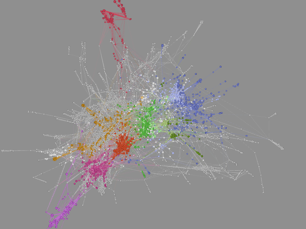 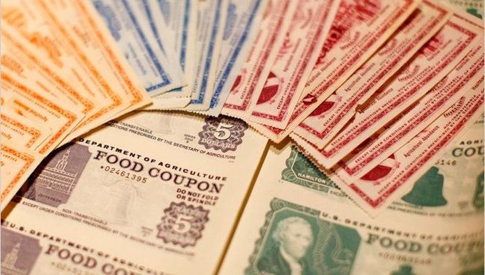 Image source: NY Times Food stamps are mysterious. They are kind of like cobras. I have never seen one up close nor do I want to. Are they actually stamps? Like mail stamps? No idea. But just because cobras are not a part of my daily life does not mean that they should be ignored. Food Stamps were utilized by over 45 million Americans in 2016 totaling $75 billion (less than 2% of the federal budget). That is not insignificant. So let’s check our privilege and become informed voters by (briefly) diving into the world of Food Stamps. First, the term “Food Stamps” is passé. The government renamed it the Supplemental Nutrition Assistance Program or SNAP in 2008, though states are free to call it whatever they want (a small victory for states’ rights). EBT is another term that occasionally appears in grocery store windows and that I surmised was loosely associated with food stamps. EBT, or Electronic Benefits Transfer, is essentially synonymous with SNAP. An EBT card has funds transferred to it at the beginning of every month which can then be used for SNAP purchases. So the “stamps” are not literal stamps. Nor were they ever really what I would consider stamps, but rather funny-colored tiny bills (see above). A person with an EBT card loaded with SNAP $$$ can purchase just about anything at a grocery store with a nutrition label. It is probably easier to list what you cannot purchase with food stamps than what you can:
Applicants have to meet certain income tests to be eligible for SNAP. They must have a net monthly income below the federal poverty level. Additionally some states have asset requirements that limit the amount of savings or property a recipient can own. Citizens can be considered categorically eligible if they meet the requirements for other federal programs. Several deductions factor into the calculations for benefits, including excessive housing costs. If an applicant spends more than 50% of their income on rent, anything above 50% can be deducted from their income for SNAP calculations. Certain aged and disabled populations also have lower restrictions on benefits from SNAP. Applying for SNAP is not easy and the application varies between states. Iowa for example has a 19 page form that looks way more complicated than a 1040 tax form. I did not even want to read it much less attempt to fill it out. The rigor in the application process is meant to curtail fraud but it also places a burden on the family receiving the benefits and increases the administrative costs for the case workers who have to review the forms. Benefits are calculated assuming a household spends 30% of its budget on food. So the difference between 30% of the net income and the maximum allowed federal benefits based on family size is the amount received. For a family of 4 the maximum benefits are $649 which is about $6 less than the projected cost of the TFP for a family with two kids aged 6-8 and 9-11. The deficit is more pronounced for a family of two adults. This emphasizes the “supplemental” part in SNAP’s name. Even purchasing scant rations based on the TFP does not guarantee an adequate diet. Exacerbating this problem is state-to-state variability in food prices. While the federal maximum benefits are fixed in the contiguous 48 states, food prices in Connecticut can be over 30% higher than the national average or 11% lower in Texas. SNAP does have some economic upside. SNAP spending by the government has a multiplier effect. For every $1 spent on SNAP the US GDP increases by $1.79. SNAP also decreases hospitalization costs and improves school attendance for children. SNAP has its benefits and drawbacks but for over 10% of Americans it is a necessity. If you want to learn more about SNAP or to try and live the SNAP life at home check out the “Food Stamped” documentary website for details. To find more specific statistics for SNAP in your state check out the interactive map at the Center on Budget and Policy Priorities. To find out more information about cobras click here.  I don’t have cable. So I did not get the chance to watch the Grammys this year. I was, however, happy to hear that Taylor Swift won the Grammy for Album of the Year for 1989 (since I recently wrote a post about how great she is). When I was writing the aforementioned post I did notice that she was nominated, but I felt pretty confident the National Academy of Recording Arts and Sciences would give it to Kendrick Lamar’s To Pimp a Butterfly. This is Swift’s second Grammy for Album of the year (she also won for Fearless as we all know). Since the data have already been scraped from the Billboard Hot 100, I might as well get some mileage out of them. For each week since November of 2014 (around when 1989 and To Pimp a Butterfly were released) I assigned any song by any of the five artists nominated for Album of the Year a point value from 1 to 100 based on its position in the Hot 100. Songs ranked number 1 were given 100 points, and songs ranked 100 were given 1 point et cetera. Then for each artist I added up the point values for each week the results of which you can see below: 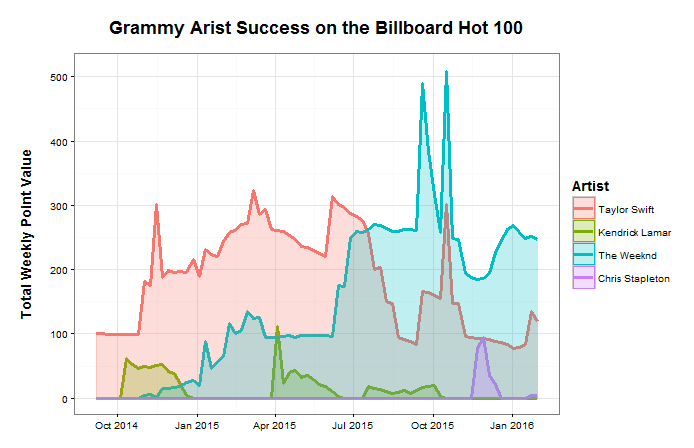 Notice someone missing from this visual? None of the songs from the Alabama Shakes’ album Sound & Color made it to the Hot 100. This is despite the fact that their album was on the Billboard 200 for album sales for 26 weeks, peaking at number 1. Chris Stapleton has a little purple blip around December, seven months after Traveller was released. Kendrick makes it on here and there, but the graph is clearly dominated by Taylor Swift and The Weeknd. The Weeknd has by far the highest peaks, but Taylor proves her popularity with the largest total area under the curve, 13,676 “points” vs. The Weeknd’s 11,156 “points”. TSwift also has the highest average per week, though not by much.
Fun fact: Swift’s “Bad Blood” was minimally successful until she added some bars by Kendrick Lamar...which went on to win the Grammy for Best Music Video. Does that say more about Taylor or Kendrick? We can debate whether song popularity should be the metric by which we measure the value of an album. Obviously a lot of people thought Sound & Color was a world-class album despite its absence from the Hot 100. In fact the National Academy of Recording Arts and Sciences insists that Album of the Year is to “honor artistic achievement, technical proficiency and overall excellence in the recording industry, without regard to album sales or chart position.” However, of those nominated this year, they did pick the one with the best album sales and chart position. “If you're horrible to me, I'm going to write a song about it, and you won't like it. That's how I operate.” – Taylor Swift Taylor Swift. Love her, hate her, love her, or love her. There really is not much of a choice as everyone seems to be constantly showering Ms. Swift with praise. While her fans are eager to show Tay some love she also has no problem sharing that love with others. As Gawker points out, she has dated what appears to be every man in the universe. Regardless of Taylor Allison Swift’s extracurricular activities you cannot deny that she is a powerhouse in the music industry. Of Taylor’s five studio albums, three have sold over a million copies in their first week making Taylor the first female artist to have done so. That is remarkable considering that I cannot recall the last time I actually bought any music. John Lennon famously claimed that The Beatles were “more popular than Jesus.” TSwift is not quite that popular, but she is close according to Google Search traffic: 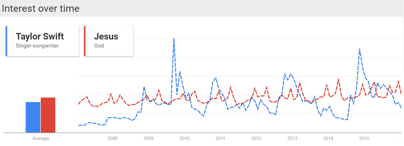 Whether Taylor or The Beatles before her, these musicians are having a large impact on in the lives of the kids. Perhaps an impact comparable to The JC. (Justin Bieber actually IS a more popular search term than Jesus over the same time span, which should be worrisome.) Being popular is nothing new for TSwift and we can measure that popularity using the charts produced by Billboard. Taylor first appeared on the Billboard Hot 100 on September 23, 2006 with her song “Tim McGraw” off of her debut album Taylor Swift. Billboard started tracking the hits of the day on its list Best Sellers in Stores way back in 1939. Shortly thereafter it started publishing two other lists, Most Played by Jockeys and Most Played in Jukeboxes. Three years later Billboard published its magnum opus, the Hot 100, which coalesced these various chart into a single definitive ranking across genres. Today the Hot 100 is composed of three components: sales (35-45%), airplay (30-40%) and streaming (20-30%) which can vary weekly in order to hit the target of 100 songs. The Streaming Songs chart is the newest and began in 2007 with data from AOL and Yahoo. It expanded to include services such as Spotify in January of 2013 and one month later added YouTube views. The Digital Songs chart tracks sales data for digital downloads while the Radio Music chart tracks radio airplay audience impressions. Both charts are generated from data furnished by Nielsen Music. Additionally Billboard publishes its YouTube data as a separate chart on its website. The Billboard charts provide a rich, publicly available data set. Using the tools over at Kimono I scraped the available data from the Hot 100, Radio Music, Digital Songs, Streaming Songs and YouTube charts since 2000. Now that I have data on hundreds of artists over the last one and a half decades I feel like anything is possible. Taylor Swift is our test case because (1) She is very popular (2) many of her songs make it onto the Hot 100 (3) her most recent album, 1989, was released after Spotify and YouTube were included on the Streaming Songs chart. Here is what 1989′s travel through the Hot 100 looks like: 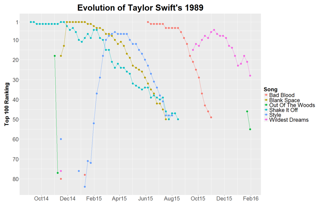 Yes it’s a bunch of lines and dots, but they tell some interesting stories. Compare the difference between “Shake It Off” and its debut at the #1 spot with the slow methodical rise of “Style.” Or Bad Blood’s resurgence after the addition of Kendrick Lamar and the release of its star-studded music video. Overall, nine of the 15 songs from Swift’s fifth album appeared on the Hot 100. At first it seemed odd that Taylor’s songs would drop off the chart once they dropped to position #50. Was this some brilliant marketing strategy? Is it not worth promoting a song anymore after it has fallen so far? Unfortunately the answer is much more mundane. Billboard labels songs as “recurrent” and removes them after 20 weeks on the chart and after falling below the 50th position. In November 2014 Swift pulled her music from the popular streaming site Spotify. This severely crippled her ability to gain on the charts through the streaming component of the Hot 100. TSwift did agree to have her music featured on Apple Music’s new service which launched June 30, 2015 after some controversy regarding its 3-month free trial period. Her ability to sway the actions of the second most valuable public company legitimizes her powerhouse status and further validates all of this work. Swift can make up for her refusal to stream by dominating on another “streaming” service, YouTube. Below is a breakdown of her trends on each of the Billboard charts I analyzed. While the Hot 100 ranks songs 1-100, the other charts only display the top 25 songs in each category. 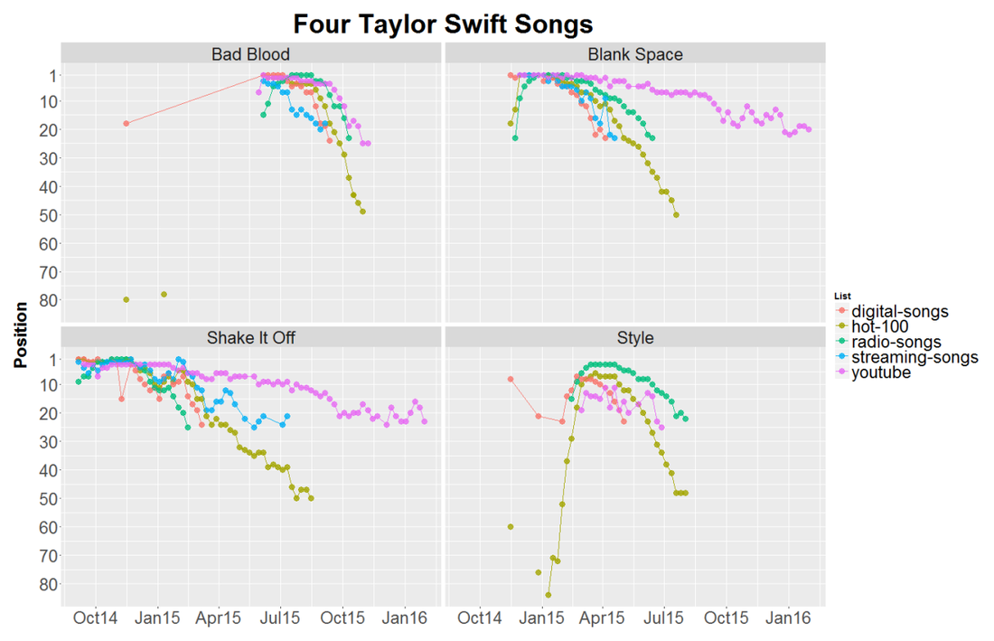 (NB physical sales of a CD are also a component of the Hot 100 ranking, but are not included above.) Some take aways: Each song had a huge increase in digital downloads when 1989 was released at the end of October, but only “Blank Space” was able to maintain that (”Shake It Off” was released prior to 1989). However, the increase in digital downloads was enough for both “Bad Blood” and “Style” to make it onto the Hot 100. YouTube views are almost always above streaming views. This makes sense since Taylor did not allow streaming on other services. If “Shake It Off” and “Blank Space” had not been labeled as recurrent they would probably still be on the Hot 100 based on their YouTube views which are very persistent. YouTube views were a leading indicator for “Bad Blood.” It made it to the top 5 of the YouTube chart a week before charting on digital downloads, the Hot 100, or radio songs. It would appear that TSwift’s mastery of music videos can single-handedly make a single. Finally I calculated the area under the curve (AUC) for each of Taylor’s songs off of 1989 and compared it to the number of YouTube views for each song. The AUC was calculated by assigning a 100 point value to position 1, 99 points to position 2 etc. and multiplied by a song’s weeks at that position. Without access to other streaming services like Spotify or Tidal and given the visual correlation between the YouTube and Streaming Songs charts I expected a strong relationship between YouTube views and success on the charts. The regression for TSwift was statistically significant. However Justin Bieber, who does not have the same qualms with distributing his music on Spotify had an even stronger correlation. This might have something to do with the fact that J-Biebs has a music video for every song off of his new album (although many of them have relatively few views) while Taylor only has videos for six of her songs. Would more music videos add buoyancy to some of her other songs? I suspect that it would. I should quickly note that analyzing the Billboard Hot 100 is not a novel idea. On his blog Modern Insights (and minor observations) Michael Kling has plotted similar analyses looking at the rise and fall of artists and songs in the Billboard Hot 100. Also very recently Cristian Cibils from Stanford University published a brief paper where he used machine learning to predict a song’s future Hot 100 trajectory based on past chart performance. I would recommend you check their posts out. Next Big Sounds is a company that tracks streaming and social media to provide unique insights into what makes songs popular and actually makes money doing it. This is just a quick overview of some of the interesting features that can be investigated using data from Billboard. Full disclosure I did most of this as a part of WNYC’s Note to Self’s Infomagical week. Tweet me which other artists you think might have interesting stories to uncover. Taylor Swift is here to stay, and while she is here she will continue to win over our hearts and most of the Grammys.  "En un agujero en el suelo, vivía un hobbit” Did you ever get your report card and have to masterfully change some of those F’s to B’s on the bus ride home? I doubt that this has ever successfully fooled anyone, but this movie trope illustrates that report cards can be terrifying. They do, however, provide a useful piece of information: feedback. Without feedback, it is difficult to tell if learning is happening. Am I closer to mastery now than I was when I started? Well, over a year ago I travelled to Mexico to visit my good friend Dave in Chiapas. I had worked my way through Duolingo and even did Rosetta Stone for a bit, so while I would not have considered myself fluent, I figured I could get by. This assumption was quickly smashed against the rocks of reality at Customs and I spent the remainder of the trip staring blankly at anyone who had the misfortune of attempting to speak to me.  The trip was still a blast, but I made a commitment to improve my Spanish over the next year. In the Spanish language section of Barnes & Noble I picked up a copy of El Hobbit by the legendary J.R.R. Tolkien. Maybe you’ve heard of it. I had been wanting to reread it for a while so why not try in Spanish. My goal was to read one page per day with a goal of finishing it within a year. At 283 pages, this seemed more than achievable. Just last week I finally learned how the story ended (happily ever after), but I had no way of knowing if I actually improved my Spanish at all. There was no feedback. There was one piece of information that I could leverage to my advantage, the number of words I translated per page. In an effort to actually retain some information I would write the translation of words or phrases I did not know over the words in the book. So I counted these up for each page. You can see the breakdown of the page totals sorted by chapter in the graph below. The average for that chapter is shown in red. 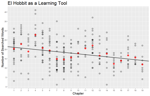 Overall the chapters had a statistically significant downward trend! I may have learned something after all. This works out to be about 2/5 of a word improvement per chapter on average, from an average of 20 words per page in chapter 1 to just under 12 words per page in chapter 19.
I am still far from being a fluent speaker. In fact this did not teach me anything about speaking Spanish. But at least I have a report card to show my parents. P.S. When I told my dad about this he responded, “Son, you’re a huge nerd.” Thanks pops. “And I’m like ‘Honestly, I don’t know nothing about mopeds’” -Macklemore Mopeds are a thing. A thing that exists. A thing that has had approximately zero influence on my life. People in Europe drive mopeds, people in America drive literally anything else. But then I watched the music video of Macklemore’s & Ryan Lewis’s new song “Downtown.” The video begins with Macklemore naively purchasing a moped which he proceeds to ride around the ‘Downtown’ for the remainder of the video. “Oh yeah mopeds, those exist” I thought, and headed to Google to see if a moped is right for me [Spoiler: It is not]. But then I wondered how many other people were similarly inspired to dive into the fabulous(?) world of mopeds. Google, of “Don’t be Evil” fame, obviously tracks every search performed on its site and the aggregated data is available through Google Trends. Below is the Google Trends plot for the search term “moped” from 2004 - present in the United States. An interactive version of this plot can be found here. 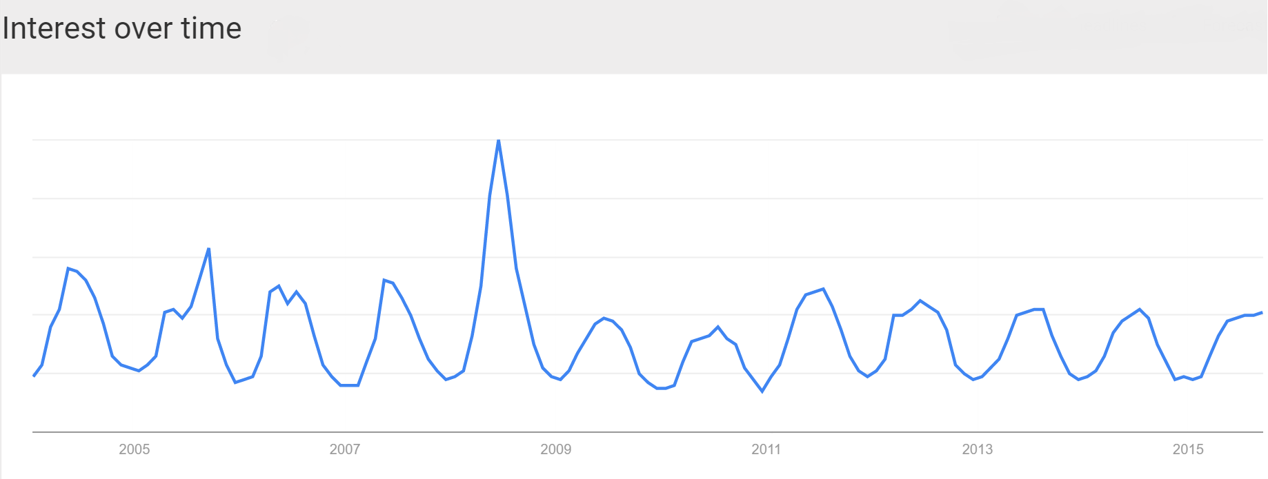 The most prominent feature is the large spike in the summer of 2008. When the financial crisis hit people were thinking of ditching their Hummers and opting for something that gets 70 mpg. What is curious is that this was not a persistent trend, even though people were supposedly strapped for cash for the next few years of the recession. Everyone did their moped research in 2008 and decided that mopeds were not for them. Conversely, everyone bought a moped in 2008 and they all still have them and have no need to ever search for anything moped related. Anecdotally, the number of mopeds I see is still approximately none so I will choose to believe the former. Because Google Trends only displays relative search numbers, and the 2008 spike was such a huge outlier, I chose to rerun the analysis from December 2008 until the present to achieve greater “resolution” to answer the question of interest. Explicitly, how has “Downtown” affected searches for mopeds? Because searches for mopeds are cyclical, we can average these to get an idea of how Macklemore’s song has deviated interest in mopeds. Here is a plot of the average number of relative moped searches by month (bold). Each individual year is also shown, with 2015 highlighted in red. 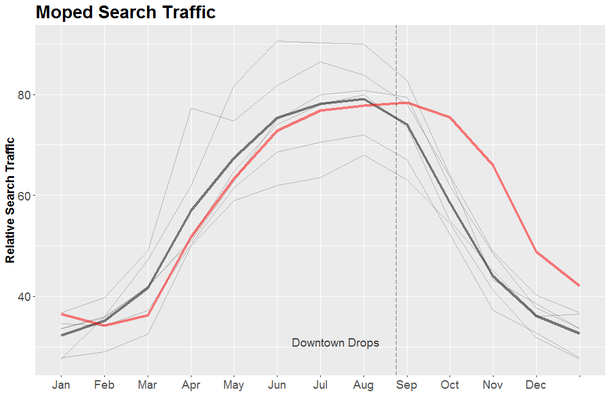 As you can see, 2015 has been a bit below average, but there was a small increase at the end of the month in August, which is when “Downtown” was released (indicated as a dotted line). Then in September, instead of dramatically plunging as Fall approaches, the number of searches for mopeds stayed relatively stable. September’s search traffic scored a 74, almost 17 points higher than the average for this time of year, and statistically different than the mean. More people than usual are actually looking for mopeds because of this ridiculous song.
There is no way to know if this increase in traffic will actually lead to more mopeds on the streets, especially when Winter is Coming. Nevertheless there appears to be a causal relationship between this song and moped searches. As “Downtown” continues to rise in the BillBoard Top 100 (it has only been on there since the September third and is currently sitting at number 16 at the time of writing) the last question we have to ask ourselves is: How much is Big Moped paying Macklemore? Click Below to Watch the “Downtown” Music Video.
[Dusk. Three 20-something white men sit around a rectangular kitchen table, several piles of white and black cards stacked in front of them. Oh and some Busch Light cans.]
This all started when no one would play Cards Against Humanity with us. So we started pulling pairs of black and white cards off the stacks and sharing the ones that we thought were funny. “Someone should make a Twitter bot that automatically posts random combinations of these,” I thought aloud. No one responded because that is a stupid thing to say at a party. When we finally finished all of the black cards I went home and did it (two days later) anyway. To be fair this HAS been done before. @CAH_bot is a fine example of one. And its about 1600 tweets ahead of me. But I did it anyway because the world deserves more Twitter bots (and because I didn’t find that account until after I did all this work). How did I do it? Well I’m glad you asked. After I tracked down some text lists of the cards, I imported them into Excel and used its RANDBETWEEN() and INDIRECT() functions to pull cards from each list and paste them together. Once I copied them into a new Notepad document I used the code in the appropriately titled “How to Write a Twitter Bot with Python and tweepy” tutorial to automatically post to Twitter. All I had to do then was create a Twitter account and away I went. So here it is: @bot_CAH This little guy is more of a rough approximation of a Twitter bot. First, I should probably write up some Python that automatically generates the posts. Also it currently posts every 15 minutes, but only when I am using my Surface. So it won’t completely spam your Twitter feed. In a perfect world I would have it post every hour from a constantly running Raspberry Pi (basically just a tiny $35 computer that’s useful for things like this). This bot works in a completely different way from my first foray into Twitter automation. My other bot, @PH_papers, is based off this post and uses dlvr.it to automatically update the account based off a Google Alerts style search from PubMed. I would recommend you follow it if you are interested in hearing about the most up-to-date Pulmonary Hypertension research. So far most of my followers are doctors from Mexico. That’s how you know you’ve made it. In closing I would just like to say that this was a fun little experiment and that it has helped to reveal some deep truths about the universe.
|
Archives
July 2023
Categories
All
|
 RSS Feed