|
James Bond, secret agent, man of mystery, world traveler. Bond traverses the globe foiling devious plots from evil masterminds in the service of the Queen. To support his missions, his tech-savvy colleague Q equips him with fantastic gadgets. He has a watch that shoots lasers, a pen that shoots lasers, and a belt buckle that shoots lasers. Anything is possible.
One of his most notable gadgets is his car, a modified Aston Martin. But a car is only as good as the road it drives on, which leads us to his final secret weapon, The Interstate Highway System. While Bond’s travels took him to far-flung, exotic places, today I want to write about the secret weapon we all have access to here in the United States. It transformed the way Americans live, it strengthened the U.S. economy, but unfortunately, it is facing an existential crisis. The idea for a supercharged network of cross-country roads came from President Dwight D. Eisenhower after his own miserable experience traversing the country in a staggeringly slow 62-day trip, as well as his experience with the German Autobahn network in World War 2. The Eisenhower National System of Interstate and Defense highways, was authorized by the Federal Aid Highway Act of 1956, the same year that the Bond novel Diamonds are Forever was published. While most secret gadgets are small and compact, the interstate highway system is over 48 thousand miles long. This is enough to (almost) circle the entire earth twice, making it larger than any other known secret spy gadget. The centrally managed construction created a logically ordered country-spanning network. Even numbers run east to west, odd numbers run north to south. Additionally, interstates have no at-grade road crossings, no stop signs or stop lights, and have limited on and off ramps. These small changes give cars the superpower to travel at greater speeds with fewer interruptions while also improving passenger safety. This increased speed transformed the average American way of life. The use of trains decreased dramatically. Interstates allowed for the suburbs to emerge, enabling workers (including spies) to live outside the city and commute into the city each day. Beyond transporting people, the key benefit of the interstate system is its ability to rapidly move goods from point A to point B. They are literally the groundwork enabling commercial growth making the interstates the secret weapon of the economy. James Bond helps the U.K.’s MI6, the interstates help the U.S0.’s GDP. Everyday almost everything we eat, buy, or use is transported via Interstate highway at some point. In 2015 the department of transportation reported that 10 billion tons of freight was moved on roads. It also enabled domestic and foreign tourism creating demand for gas stations, motels, restaurants and most importantly, roadside tourist traps including the biggest ball of twine, carhenge (a stone henge made of cars), and the Spam museum. These are monumental benefits, but James Bond always had Q to ensure his gadgets were always tip top shape. The U.S. has an army of Q’s constantly repairing our roads, but despite their best efforts, they continue to crumble faster than they can be mended. The federal highway system is funded, in large part, by a tax on gasoline. This tax currently sits at 18.4 cents per gallon, which is not a lot. The last gasoline tax increase was made by president Clinton in 1993. As a result, revenues have not been adequate since 2008 and billions of dollars of projects go unfunded every year. In 2017, The Infrastructure Report Card gave America’s road infrastructure a D. Imagine if James Bond was still getting paid a 1993 salary in 2021. That doesn’t buy many martinis. The gas tax should be raised. Alternatively, the federal government could devise another means to raise revenues to hire more Q’s to maintain our beloved interstate highways. Now, an argument could be made that we shouldn’t fix the roads at all if they are being used by international spies. However, I would contend that we all need these roads. As described above, they are a fundamental part of American life, they are critical for our economic infrastructure, and despite their flaws, they should be saved from this crisis. The Interstate Highway System is a secret weapon that millions of Americans use use everyday, even if it does help a few pesky spies. This post was adapted from a seven-minute speech presented at a Toastmasters club.
0 Comments
Previously, I presented information on the agency composition over time of American Association for the Advancement of Science (AAAS) Science and Technology Policy Fellows (STPF). This analysis was based on the data collected from the publicly available database of AAAS fellows. The goal of the program is to place Ph.D.-level scientists into the federal government to broadly increase science- and evidence-based policy. The STPF program consists of both executive and legislative branch fellows. Executive branch fellows enter into a one-year fellowship, with the option to extend their fellowship after their first year. Additionally, fellows can reapply to transition their fellowship to other offices around the federal government. To extend my previous analysis, I re-analyzed the data to discover the "destiny" of first-year fellows. How many fellows chose to stay in the same agency after their first year, leave the program, or switch agencies? 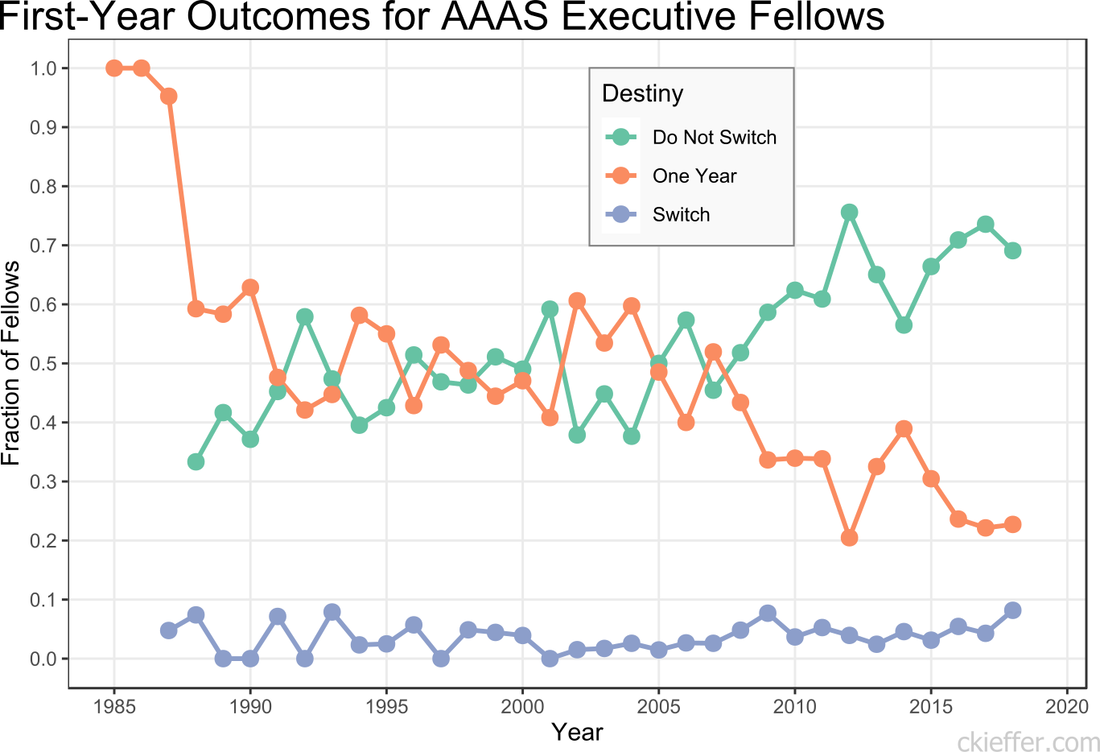 The number of fellows that “Do Not Switch” and remain in the same office for both years, has been trending upwards over time. Over the past five years, on average, 67.3 percent of fellows completed both years of their fellowship in the same agency. The remaining 32.7 percent either left after the first year or switched to a different agency. Reasons for this increasing trend are not discernible from the data. More and more offices (or even fellows) may be treating this as a full two-year fellowship rather than a one-and-one. Early executive branch fellows only had a one-year fellowship, leading to the dramatic 100 percent program exit after a single year. Historically, the percentage of executive branch fellows who switch offices between their first and second years has been low and has never exceeded nine percent. However, the year with the largest number of switches was recent. The largest total number of switches was by fellows who began their first year in 2018, nine (8.1 percent) switched agencies. That year, six of the nine fellows who switched departments moved into the Department of State. The largest number of one-year switches out of a single agency was four. The data were not analyzed for office switches within the same agency and only inter-agency transfers are recorded as changes. This may lead to under-reporting of position switches. Additionally, some fellows who leave the STPF program after their first year may have received full-time positions at their host agency. While they are no longer fellows, they did not actually leave leave their agency and conceivably could have stayed for a second year of the STPF program there. Unlike the executive branch fellowship, AAAS’s legislative branch fellowship is only a one-year program. However, some legislative branch fellows apply for, and eventually receive, executive branch fellowships. Over the history of the fellowship program 106 fellows have moved directly from congress into an executive branch fellowship the following year. This is out of the total 1,399 congressional fellows. The previous five-year average for fellows moving from The Hill to the executive branch is 7.2 fellows per year or 36 total fellows in the past five years. Overall, it appears that the AAAS STPF program’s opaque agency-fellow matching process is doing an increasingly good job of helping fellows find agencies where they are happy to live out the full two years of their executive branch fellowship experience. In these “strange times,” running has become a lifeline to the outdoors. It is one of the few legitimate excuses to venture outside of my efficiently-sized apartment. I started running in graduate school to manage stress and, even as my physical body continues to deteriorate, I continue to use running to shore up my mental stability. As the severity of the COVID-19 situation raises the stress floor across the nation, maintaining--or even developing--a simple running routine is restorative. I use the Strava phone app to track my runs. This app records times and distance traveled which is posted to a social-media-esque timeline for others to see. I choose this app after very little market research, but it seems to function well most of the time and is popular enough that many of my friends also use it. My favorite feature of the app is the post-run map. At the end of each session, it shows a little map collected via GPS coordinates throughout my jog. This feature is not without its flaws. In 2018, Strava published a heatmap of all its users’ data, which included routes mapping overseas US military bases. Publishing your current location data is a huge operational security (OPSEC) violation. Strangers could easily identify your common routes and even get a good idea of where you live. I recommend updating your privacy settings to only show runs to confirmed friends. With all that said, I wanted to create my own OPSEC-violating heatmap. Essentially, can I plot all of the routes that I have run in the past 18 months on a single map? Yes! Thanks to the regulations in Europe’s GDPR, many apps have made all your data available to you, the person who actually created the data. This includes Strava, which allows you to export your entire account. It is your data so you should have access to it. If you use Strava, it is simple to download all of your information. Just login to your account via a web browser, go to settings, then my account, and, under “Download or Delete Your Account,” select “Get Started.” Strava will email you a .zip folder with all of your information. This folder is chock full of all kinds of goodies, but the real nuggets are in the “activities” folder. Here you will find a list of files with 10-digit names, each one representing an activity. You did all of these! These files are stored in the GPS Exchange (GPX) file format, which tracks your run as a sequence of points. The latitude and longitude points are coupled with both the time and elevation at that point. Strava uses this raw information to calculate all your run statistics! With this data an enterprising young developer could make their own run-tracking application. But that’s not me. Instead, I am doing much simpler: plotting the routes simultaneously on a single map. Here is what that looks like: 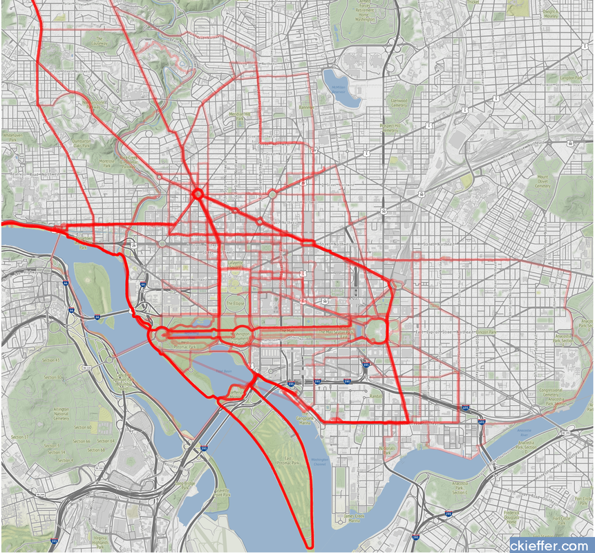 Again, this is a huge OPSEC violation so please do not be creepy. However, the routes are repetitive enough that it is not too revealing. Each red line represents a route that I ran. Each line is 80% transparent, so lighter pink lines were run less frequently than darker red lines. You can see that I run through East Potomac Park frequently. Massachusetts Avenue is a huge thoroughfare as well. I focused the map on the downtown Washington D.C. area. I used the SP and OpenStreetMap packages in R for plotting.
The well-tread paths on the map are not really surprising, but it does give me some ideas for ways to expand my route repertoire. My runs are centered tightly around the National Mall. I need to give SW and NE DC a little more love. I should also do some runs in Rosslyn (but the hills) or try to head south towards the airport on the Virginia side of the river. What did we learn from this exercise? Very little. This is an example of using a person’s own available data. What other websites also allow total data downloads? How can that data be visualized? Make yourself aware of where your data exists in the digital world and, if you can, use that data to learn something about your real world. My R code is available on GitHub. Note: Eagle-eyed readers may be able to identify a route where I walked across water. Is this an error or am I the second-coming? Who can say? Since 1973, the American Association for the Advancement of Science (AAAS) has facilitated the Science & Technology Policy fellowship (STPF). The goal of the program is to infuse scientific thinking into the political decision making process, as well as developing a workforce that is knowledgeable in both policymaking and science. Intuitively, it makes sense to place evidence-focused scientists in the government to support key decisions makers. Each year doctoral-level scientists are placed throughout the federal government for one to two year fellowships. Initially the program placed scientists exclusively in the Legislative branch, but as the program grew, placements in the Executive branch became more common. In 2019, hundreds of scientists were placed in 21 different agencies throughout the federal government. As one of those fellows, I wanted to create a Microsoft Excel-based directory of current fellows. However, what began as a project to develop a simple CSV file turned into a visual exploration of the historic and current composition of the AAAS STPF program. Below are some of my observations. Data was collected from the publicly available Fellow Directory. 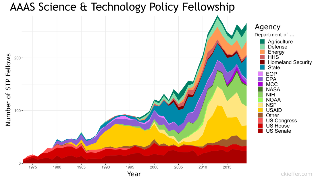 In the beginning of the STPF program, 100% of fellows were placed in the Legislative Branch. This continued until the first Executive branch fellows around 1980 were placed in the State Department, Executive Office of the President (EOP), and the Environmental Protection Agency (EPA). In 1986, the number of Executive Branch fellows overtook the number of Legislative Branch Fellows for the first time. Since those initial Executive Branch placements, fellows have found homes in 43 different organizations. The U.S. Senate has had the largest total number of fellows while the U.S. Agency for International Development (USAID) is the Executive Branch agency that has had the most placements. Unfortunately, for the clarity of the figure, agencies with fewer than twenty total fellow placements were grouped into a single "other" category. Despite the mundane label, this category represents strength and diversity of the AAAS STPF. The "other" category encompasses 25 different agencies including the Bureau of Labor Statistics, the World Bank, the Bill and Melinda Gates Foundation, and the RAND Corporation. In 2017, fellows were placed in 24 different organizations, the most diverse of any year. The total number of fellows has dramatically increased over the past 45 years (as seen in the grey bar plot at the bottom of the figure). The initial cohort of congressional fellows in 1973 had just seven enterprising scientists. Compare that to 2013 when a total of 282 fellows were selected and placed. This year (2019) tied 2014 for the second highest number of placements with 268 fellows. One of the most striking observations is the trends in placement at USAID. In 1982 USAID began to sponsor AAAS Executive Branch fellows, with one placement. Placements at USAID quickly grew, ballooning to over 50% of total fellow placements in 1992. However, just as rapidly, the placement fraction at USAID decreased during the 2000s despite only a small increase in the overall number of fellows. This trend ultimately began to reverse in 2010, and a large increase in the total number of fellows found placement opportunities at USAID. The reader is left to craft their own explanatory narrative. One thing is clear from the data: the AAAS STPF is as strong as it has ever been. Placement numbers are close to all-time highs and fellows are represented at a robust number of agencies. Only time will tell if the experience these fellows gain will help them achieve the program's mission "to develop and execute solutions to address societal challenges." If you want to learn more about the history of the STPF, including statistics for each class, AAAS has an interactive timeline on their website. An unexpected surprise during the analysis was the discovery that Dr. Rodney McKay and John Sheppard (both of Stargate Atlantis fame) were STP fellows. Or--more likely--the developer for the Fellows Directory was a fan of the show. Unfortunately, as a Canadian citizen, Dr. McKay would be ineligible for the AAAS STPF. 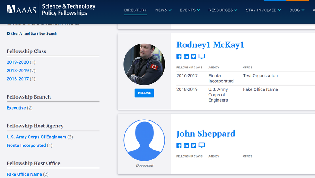 Recently at brunch someone made a statement about there being only one person with a PhD in the US House of Representatives. This did not seem probable to me and after some Googling, I found that the House Library conveniently maintains a list of doctoral degree holders in the 116th House. 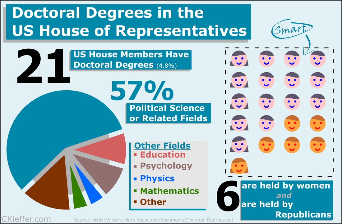 Though there is only one hard science PhD in the house (Bill Foster, D-IL; Physics), there are also other STEM doctorate holders in the House including two psychologists, a mathematician, and a monogastric nutritionist. There are also obviously quite a few other doctorate holders, most of which are in political science (obviously), but also a Doctor of Ministry from Alabama (Guess the political party!).
Overall 21 is a small fraction of the House (only 4.8%), especially compared to the 157 members that are lawyers. Given the wide-reaching and technical nature of the government and the laws that regulate it, it may be advantageous to increase the number of scientists represented in Congress. While that is a decision ultimately for each state's voters, there are a number of programs aimed at increasing the involvement of scientists in government policy. As an infographic making exercise I would consider this a mixed success. I think it conveys the information effectively, but lacks a certain je ne sai quoi in the aesthetics department. My little emoji heads especially could use some work. Any graphic designers out there please reach out with tips. The House Library maintains lists of lawyers, military service members, medical professionals, as well as other specialties in their membership profile. I am going to download these lists as a baseline for the analysis of future Congresses. 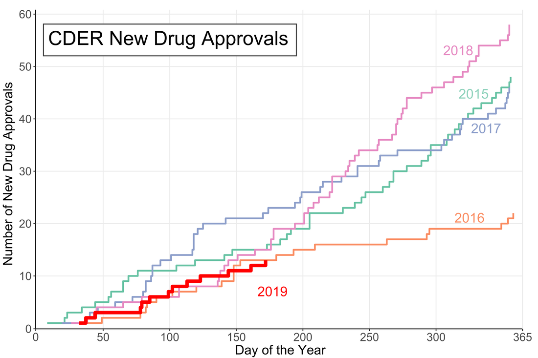 A little over halfway through the year and the US Food and Drug Administration (FDA) appears to be on track for either a big year of new drug approvals or....not. The number of new molecular entities (NMEs) approved by FDA's Center for Drug Evaluation and Research (CDER) are equal to the number approved at this point of the year in 2016 and only two product apporvals behind both 2018 and 2015. Despite starting the year off with the longest federal shutdown in history the FDA is keeping pace with past years.
However, the figure demonstrates another important fact: approval numbers mid-year do not correlate strongly with year-end approvals. While the number of approvals were similar in 2016 and 2018, the end year totals were wildly different. In 2018, CDER approved a record 59 NMEs while 2016 approved less than half of that number. Additionally, in 2017, the number of NME approvals at mid-year was much higher than any other year, but finished in line with the number of approvals in 2015 and well below the number of approvals in 2018. It seems that the future could go either way. There could be a dramatic up-tic in CDER approval rate as in 2018 (perhaps from shutdown-delayed applications) or the rate could slow to a crawl like in 2016. Let’s say you want to buy a new car. Now, you aren’t a car expert, but you have a general idea of features you want in your slick new whip and you can find a market-determined price for the car you want online. Every day that your new car gets you from point A to point B without violently exploding you’ll know that you made a good decision. This is what cars are like.
Drugs are not like cars. Drugs are complicated little molecules pressed into tablets that a doctor tells you to take one, two, three times per day, maybe until you die. How much do drugs cost? They cost whatever your pharmacist says they cost. Drug prices are obscured both by a lack of patient drug expertise and the complex negotiations between insurers, manufacturers, pharmacy benefit managers (PBMs) and pharmacies. Because patients cannot easily find a price for a drug it is fair to ask if they are paying too much. Fear not! The government regulates drugs, pharmacies, AND insurance companies. The government recognizes that patients do not know a lot about drugs and steps in to protect them. In fact, one of President Trump’s campaign promises was to lower the out-of-pocket costs for drugs. To that end, the Department of Health and Human Services (HHS) released American Patients First, (APF) Trump’s blueprint to lower drug prices. It’s essentially a series of hypothetical plans that could maybe lower the cost of prescriptions in the United States. The APF correctly points out that consumers asked to pay $50 vs. $10 are 4 times more likely to abandon their prescription at the pharmacy. We want patients to be able to afford their medications and to therefore be healthier. This is an important point to remember: reducing out-of-pocket costs is only useful if it increases health. Let’s see how the APF will make Americans healthier. First we need to understand the justification for this beautiful document. Why are drug prices high? Well one given reason is that the 1990s saw the release of several “blockbuster” drugs that dramatically increased pharmaceutical company revenues. However, many of these drugs lost patent protection in the mid-2000s. In order to maintain constant revenue streams, the APF posits, companies raised prices on other drugs. The Affordable Care Act (ACA) put upward pressure on drug prices in a few ways. First it increased the number of critical-need healthcare facilities that receive mandatory discounts on drugs (340B entities). It also placed taxes on branded prescription drug sales. This was implemented to shift patients and organizations away from using brand-name (read: expensive) drugs when generics are available. To pay these taxes however, drug costs had to go up. All of these justifications for high drug prices establish a pattern: if one person is paying less then the costs shift somewhere else. Someone has to pay. How does the APF plan propose to tackle high out-of-pocket costs? The strategies are presented as a four-point plan. First, it proposes that the US increase competition in pharmaceutical markets. Classic free market stuff right here. One part is a FDA regulatory change which prevents a company from blocking entry of generic competitors into the market. Seems like a straightforward good idea. The other noteworthy idea here is to change how a certain class of expensive injectable drugs, biologics, are billed. This would prevent “a race to the bottom” in biologic pricing which would make the market less attractive for generic competition. Essentially this rule could help keep biologic prices high, to make the market profitable, so there is generic competition, to lower prices. It is difficult to predict if this would work or not. The second objective is to improve government negotiation tools. This part is pretty fleshed out, with 9 different bullet points. However 8 of the 9 points relate to Medicaid or Medicare primarily helping old and/or poor people. Right now drug coverage by Medicare cannot take price into consideration when deciding whether to cover a drug. If the largest insurer in the country (the government) can start negotiating on prices, the market could shift dramatically. However someone has to pay and this may shift prices to private plans. Another goal in this section is the work with the commerce department to address the unfair disparity between drug prices in America and other countries. It is unclear how this would be achieved. The third objective is to create incentives for lower list prices. Drugs have many different prices based on who is paying on them. Companies may be incentivized to raise list prices to increase reimbursement rates since they often only receive a portion of the list price for a drug. However if the drug is not covered by a patient’s plan they could be on the hook for the inflated list price. One of the most widely criticized parts of the APF plan is to include list prices in direct-to-consumer advertising. Since most people do not pay the list price, is it even helpful to include? Probably not. The final objective is to bring down out-of-pocket costs. I thought this was the purpose of the whole document so I was surprised that it is also one of the sub-sections. Both of the proposals here target Medicare Part D, so they may have limited benefits to non-Medicare patients. One proposal is to block “gag clauses” that prevent pharmacies from telling patients when they could save money by not using insurance. While this will indeed lower out of pocket costs for certain prescriptions, the point of insurance is to spread out the costs. The inevitable side effect will be price increases in other prescriptions. The long final portion of the document is a topic by topic list of questions that need to be addressed. Who knew that healthcare was so complicated? There are some good ideas in here that need to be explored like indication-based pricing or outcomes-based contracts. Austin Frakt has a good piece on these here. My favorite question in the section is: “How and by whom should value be determined??” Yes the question in the APF includes the double question marks. This questions really gets to the philosophical crux of the healthcare problem. It should be pretty simple to solve. Here are some other quotes: “Should PBMs be obligated to act solely in the interest of the entity for whom they are managing pharmaceutical benefits?”
As of this writing, none of these policies have been implemented, but the President could instruct the FDA to begin them theoretically whenever. There are still many implications to these policies that are unknown. Each one likely has unintended consequences, as all policies do. The two critical questions we need to ask of our policy makers going forward are:
So uh good luck to us. First go visit willrobotstakemyjob.com. Will you lose your job to robots? A lot of articles and think pieces recently have touted the artificial intelligence (AI) revolution as a major job killer. And it probably will be...in a few decades. One of the most commonly studied AI systems are neural networks. In this post I want to demonstrate that, although neural networks are powerful, they are still a long way away from replacing people.
Some brief background: All types of neural networks are, wait for it, composed of neurons. Similar to the neurons in our brains, these mathematical neurons are connected to each other. When we train the network, by showing it data and rating its performance, we teach it how to connect these neurons together to give us the output that we want. It's like training a dog. It does not understand the words that we are saying, but eventually it learns that if it rolls over, it gets a treat. This video goes into more depth if you are curious.[1] Conventional neural networks take a fixed input, like a 128x128 pixel picture, and produce a fixed output, like a 1 if the picture is a dog and a 0 if it is not. A recurrent neural network (RNN) works sequentially to analyze different sized inputs and produce varied outputs. For instance, RNNs can take a string of text and predict what the next letter should be, given what letters preceded it. What is important to know about them is that they work sequentially and that gives them POWER. I originally heard about these powerful RNNs from a Computerphile video where they trained a neural network to write YouTube comments (even YouTube trolls will be supplanted by AI). The video directed me to Andrej Karpathy’s “The Unreasonable Effectiveness of Recurrent Neural Networks”. Karpathy is the director of AI at TESLA and STILL describes RNNs as magical. That is how great they are. His article was so inspiring that I wanted to train my very own RNN. Luckily for me, Karpathy had already published a RNN character-level language model char-rnn [2]. Essentially it takes a sequence of text and trains a computer program to predict what character comes next. With most of the work setting up the RNN system done, the only decision left was to decide what to train the model on. Karpathy's examples included Shakespeare, War and Peace, and Linux code. I wanted to try something unique obviously and because I'm a huge fucking nerd I choose to scrape the Star Trek: Deep Space 9 plot summaries and quotable quotes from the Star Trek wiki [3]. Ideally, the network would train on this corpus of text and generate interesting or funny plot mashups. However, after training the network on the DS9 plot summaries and quotes, I realized that there was not enough text to train the network well. The output was not very coherent. The only logical thing to do was to gather more Star Trek related content, namely, the text from The Next Generation and Voyager episode wiki pages. After gathering the new text, the training data set had a more respectable 1,310,922 words (still small by machine learning standards). [Technical paragraph] The network itself was a Long-Short Term Memory (LSTM) network (a type of RNN). The network had 2 layers, each with 128 hidden neurons (these are all the default settings by the way). It took ~24 hours to train the RNN. Normally neural network scientists use specialized high-speed servers. I used my Surface Pro 3. My Surface was not happy about it. "Show us the results!" Fine. Here is some of the generated text: "She says that they are on the station, but Seven asks what she put a protection that they do anything has thought they managen to the Ompjoran and Sisko reports to Janeway that he believes that the attack when a female day and agrees to a starship reason. But Sisko does not care about a planet, and Data are all as bad computer and the captain sounds version is in suspicions. But she sees an office in her advancement by several situation but the enemy realizes he had been redued and then the Borg has to kill him and they will be consoled" Not exactly Infinite Jest, but almost all of those are real (Star Trek) words. Almost like a Star Trek mashup fever dream. Who are the Ompjoran? Why doesn't Sisko care about a planet? What is a starship reason? It all seems silly but what is amazing about this output is that the RNN had to learn the English language completely from scratch. It learned commas, periods, capitalization and that the Borg are murderous space aliens. One variable that I can control is the "temperature" of the network output. This tells the RNN how much freedom it has in choosing the next character in a sequence. A high temperature allows for more variability in the results. A temperature close to zero always chooses the most likely next character. This leads to a boring infinite loop: "the ship is a security officer and the ship is a security officer and the ship is a security officer and the ship is a security officer and the ship is a security officer" Here is an example of some high-temperature shenanigans. Notice how, like a moody teen, it does whatever it wants: "It is hoar blagk agable,. Captainck, yeve things he has O'Brien what she could soon be EMH 3 vitall I "Talarias)" If you want to read more RNN generated output, I have a 15,000 character document here. At one point it says "I want to die" which is pretty ominous. Seriously check it out. For future reference, Star Trek may actually be a bad training set. Many of the words in the show are made up so the network can be justified in also making up words. Hopefully it is clear to all the Star Trek writers reading this that your jobs are safe from artificial intelligence. For the rest of you, your jobs are probably pretty safe too. For now. William Riker [a human]: "You're a wise man, my friend." Data [an android]: "Not yet, sir. But with your help, I am learning." [1] If you are really curious about neural networks this free online book is a good resource. [2] I actually used a TensorFlow Python implementation of Karpathy’s char-rnn code found here. [3] You can find my code and input files on GitHub here. Bill James’s Pythagorean expectation is a simple equation that takes the points scored by a team and the points scored against that team over a season and predicts their win percentage. Originally developed for baseball, it was adapted in the early 2000s for football, the other football, basketball, and hockey. In the interest of science I applied the same equation to our intramural Ultimate Frisbee team “The Jeff Shaw Experience”:
\[ Win\% = \frac{(Points For)^2}{(Points For)^2 + (Points Against)^2} \] Our Ultimate Frisbee Team’s expected win percentage based on this formula is 36.9%. Over a four game “season” this roughly translates to 1.5 wins. This seems like a significant departure from our actual 0.500 record. Of course, it’s impossible to win 0.5 games, so the only possibilities are winning 1 or 2 games (or 0 or 3 or 4). Still, there is something that we can learn about our team by our over performance. When we lose a game, we lose by a lot, but when we win, it is often close. As our team’s example makes obvious, a longer season would allow for better predictions. With enough games we could even set up an ELO system to predict the winners of individual games (like FiveThirtyEight does for seemingly every sport). This also assumes 2 is the proper Pythagorean exponent for Ultimate Frisbee and this league, but that is a topic that is WAYYY too big for this blog. Hopefully our first playoff game will give us a much needed data point to further refine our expected wins. Hopefully our expected wins go up. Remember Super Bowl LI you guys? It happened, at minimum, five days ago and of course Tom Brady won what was actually one of the best Super Bowls in recent memory. Football, however, is only one half of the Super Bowl Sunday coin. The other half are the 60 second celebrations of capitalism: the Super Bowl Commercials. Everyone has a list of favorites. Forbes has a list. Cracked has a video. But it is no longer politically correct in this Great country to hand out participation trophies, someone needs to decide who actually won the Advertisement Game. To tackle (AHAHA) this question I turned to the infinite online data repository, Google Trends, which tracks online search traffic. Using a list of commercials compiled during the game (AKA I got zero bathroom breaks) I downloaded the relative search volume in the United States for each company/product relative to the first commercial I saw for Google Home. [Author’s note: Only commercials shown in Nebraska, before the 4th quarter when my stream was cut, are included]. Here’s an example of what that looked like: 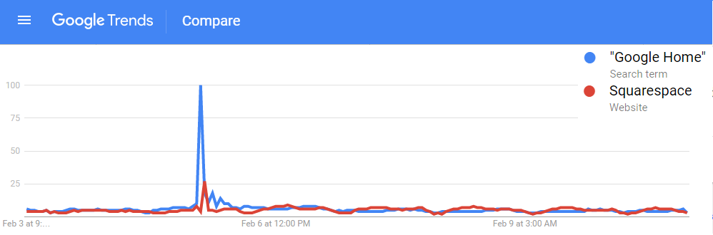 !The search traffic for a product instantly increased when a commercial was shown! You can see exactly in which hour a commercial was shown based on the traffic spike. Using the traffic spike as ground zero, I added up search traffic 24 hours prior to and after the commercial to see if the ad significantly increased the public’s interest in the product. Below is a plot of each commercial, with the percent of search traffic after the commercial on the vertical axis and the highest peak search volume on the horizontal. If you look closely you will see that some of them are labeled. If a point is below the dotted line the product had less search traffic after the commercial than before (not good). 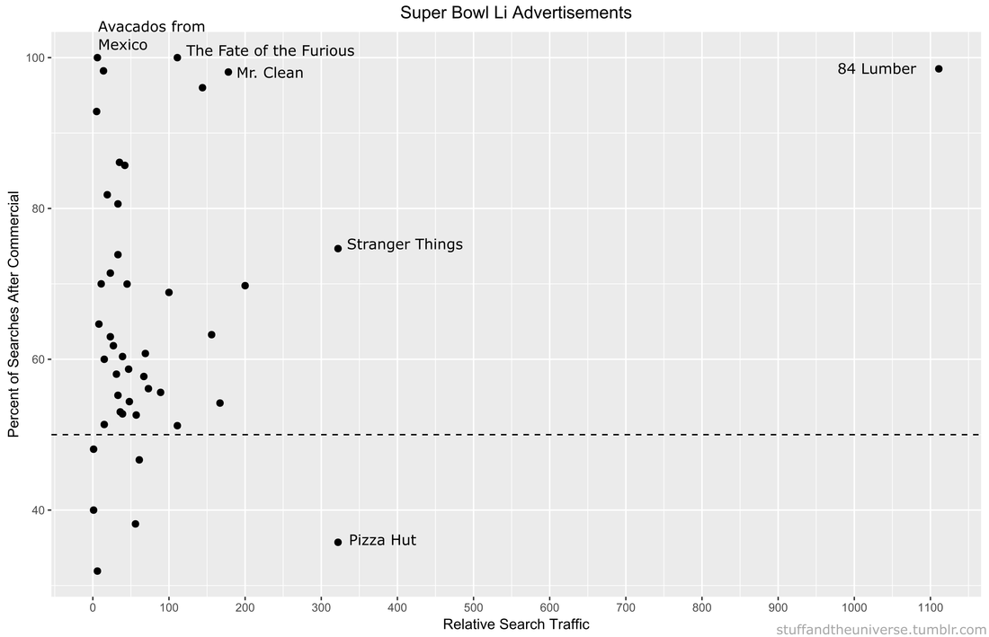 On average 86% of products had more traffic after their Super Bowl ad than before it. But there are no participation trophies in the world of marketing and the clear winner is 84 Lumber. Damn. They are really in a league of their own (another sports reference!). Almost no one was searching for them before the Super Bowl but oh boy was everyone searching for them afterwards. They used the ole only-show-half-of-a-commercial trick where you need to see what happens next but can only do that by going to their website. Turns out its a construction supplies company
Pizza Hut had a pretty large spike during their commercial, but it actually was not their largest search volume of the night. Turns out most people are searching for pizza BEFORE the Super Bowl. Stranger Things 2 also drew a lot of searches for obvious reason. We all love making small children face existential Lovecraftian horrors. Other people loved the tightly-clad white knight Mr. Clean and his sensual mopping moves. The Fate of the Furious commercial drew lots of searches, most likely of people trying to decipher WTF the plot is about. Finally there was the lovable Avocados from Mexico commercial. No one was searching for Avocados from Mexico before the Super Bowl, but now, like, a couple of people are searching for them. Win. So congratulations 84 Lumber on your victory in the Advertisement Game. I’m sure this will set a dangerous precedent for the half-ads in Super Bowl LII. |
Archives
July 2023
Categories
All
|
 RSS Feed