|
The Department of Pharmacology at Creighton University School of Medicine is small, but mighty. There are only 10 professors or principal investigators (PIs) in the department, but this small size has its advantages. Or at least that is what we tell ourselves. A recent paper in Nature argued that bigger is not always better when it comes to labs and we are putting that to the test. Ideally with a smaller faculty, there would be more collaboration. Everyone knows what everyone else is doing, more or less, so they can more efficiently leverage the various expertise found throughout the department. To measure how interconnected the pharmacology department was I created a network analysis visualization based on who published with whom. Using NCBI’s FLink tool I downloaded a list of the publications in the PubMed database for each PI in the pharmacology department at CU. A quick script in R formatted the authors and created a two-column “edge list” for each author, basically a list of every connection. This was imported into the free, open-sourced network analysis program Gephi which crunched the numbers and produced a stunning map of the connections in the pharmacology dept: 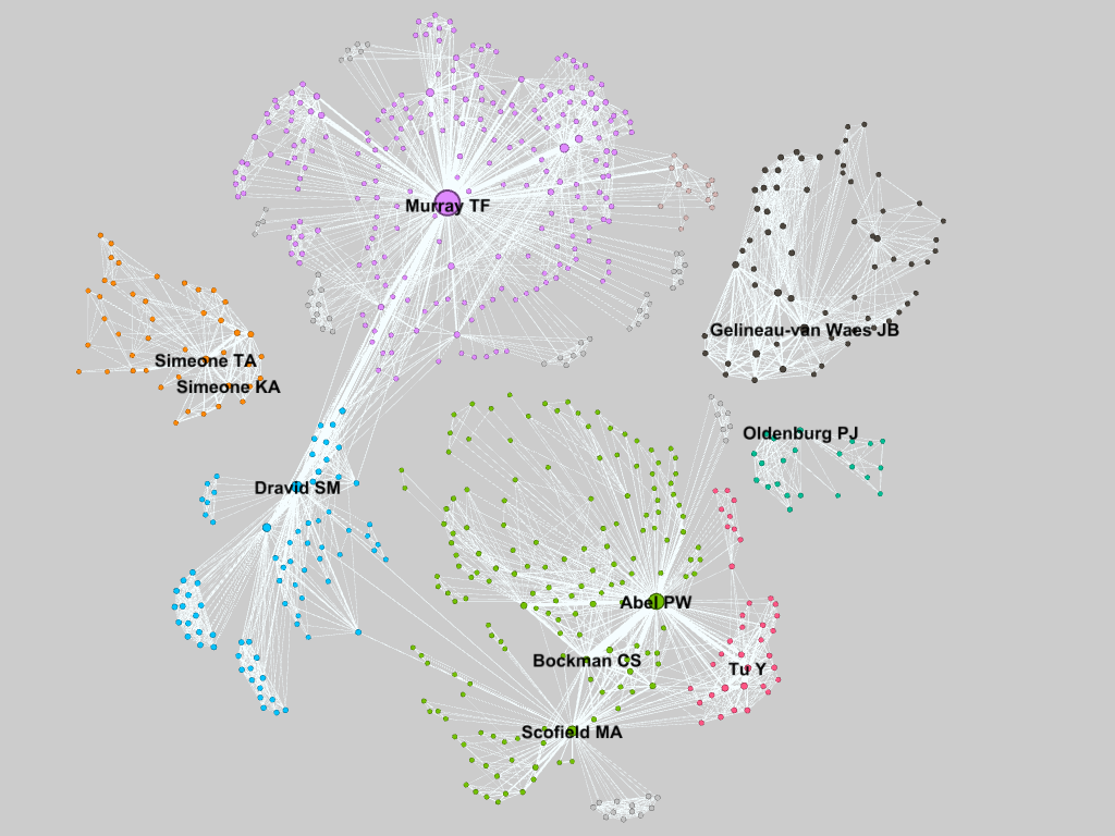 Gephi automatically determines similar clusters (seen as different colors) which are unsurprisingly centered on the various PIs in the department since those are the publications I was looking at. Dr. Murray, the department chair, has the most connections, also known as the highest degree, at 292, followed by Dr. Abel. Drs. Dravid and Scofield are ranked 2nd and 3rd respectively for betweenness centrality, after Dr. Murray. They are the gatekeepers that connect Drs. Abel, Bockman, and Tu to Dr. Murray. Each point’s size is proportional to its eigenvalue centrality, similar to Google’s Pagerank metric of importance. I was a bit surprised at how disperse the department was. 60% of the PIs could be connected, and many have strong relationships. However the rest are floating on their own islands. Dr. Oldenburg is relatively new so this is not surprising. The Simeones (who are married) are closely connected. Also unsurprising. This was a quick and dirty analysis and a few of the finer points slipped through the cracks. Some of the names are common in PubMed (especially Tu). so I did my best to filter what was there and only look at publications affiliated with Creighton. Unfortunately this filters out publications from other institutions by the same author. Also not everyone is attributed the same way on every manuscript. This is especially true for Drs. KA Simeone and Gelineau-Van Waes who have published under different last names, but also because sometimes a middle name is given and sometimes it is omitted. I tried my best to standardize the spellings for each PI, but with over 700 nodes I could not double check every author to ensure there were not duplicates elsewhere. If more than one PI shows up on a paper, that paper may show up under both searches. This should not increase the number of edges, but would affect the “strength” of those connections. The connections are about what I had imagined. The brain people are on one side, everyone else is on the other. Expanding the search to include the papers from coauthors outside of the pharmacology department might discover more interesting connections. Just for fun I went ahead and pulled the data for every paper on PubMed with a Creighton affiliation. I could not even find my department on the visualization without searching for it. It is massive. The breadth of Creighton’s interconnected-ness forces me to marvel at how vast the community of scientists must truly be. So many people working to improve the body of knowledge of the human race. We are really just small bacteria in a very large petri dish. 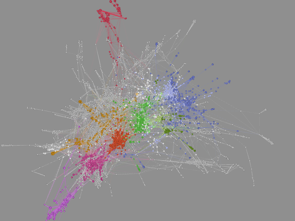
1 Comment
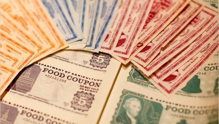 Image source: NY Times Food stamps are mysterious. They are kind of like cobras. I have never seen one up close nor do I want to. Are they actually stamps? Like mail stamps? No idea. But just because cobras are not a part of my daily life does not mean that they should be ignored. Food Stamps were utilized by over 45 million Americans in 2016 totaling $75 billion (less than 2% of the federal budget). That is not insignificant. So let’s check our privilege and become informed voters by (briefly) diving into the world of Food Stamps. First, the term “Food Stamps” is passé. The government renamed it the Supplemental Nutrition Assistance Program or SNAP in 2008, though states are free to call it whatever they want (a small victory for states’ rights). EBT is another term that occasionally appears in grocery store windows and that I surmised was loosely associated with food stamps. EBT, or Electronic Benefits Transfer, is essentially synonymous with SNAP. An EBT card has funds transferred to it at the beginning of every month which can then be used for SNAP purchases. So the “stamps” are not literal stamps. Nor were they ever really what I would consider stamps, but rather funny-colored tiny bills (see above). A person with an EBT card loaded with SNAP $$$ can purchase just about anything at a grocery store with a nutrition label. It is probably easier to list what you cannot purchase with food stamps than what you can:
Applicants have to meet certain income tests to be eligible for SNAP. They must have a net monthly income below the federal poverty level. Additionally some states have asset requirements that limit the amount of savings or property a recipient can own. Citizens can be considered categorically eligible if they meet the requirements for other federal programs. Several deductions factor into the calculations for benefits, including excessive housing costs. If an applicant spends more than 50% of their income on rent, anything above 50% can be deducted from their income for SNAP calculations. Certain aged and disabled populations also have lower restrictions on benefits from SNAP. Applying for SNAP is not easy and the application varies between states. Iowa for example has a 19 page form that looks way more complicated than a 1040 tax form. I did not even want to read it much less attempt to fill it out. The rigor in the application process is meant to curtail fraud but it also places a burden on the family receiving the benefits and increases the administrative costs for the case workers who have to review the forms. Benefits are calculated assuming a household spends 30% of its budget on food. So the difference between 30% of the net income and the maximum allowed federal benefits based on family size is the amount received. For a family of 4 the maximum benefits are $649 which is about $6 less than the projected cost of the TFP for a family with two kids aged 6-8 and 9-11. The deficit is more pronounced for a family of two adults. This emphasizes the “supplemental” part in SNAP’s name. Even purchasing scant rations based on the TFP does not guarantee an adequate diet. Exacerbating this problem is state-to-state variability in food prices. While the federal maximum benefits are fixed in the contiguous 48 states, food prices in Connecticut can be over 30% higher than the national average or 11% lower in Texas. SNAP does have some economic upside. SNAP spending by the government has a multiplier effect. For every $1 spent on SNAP the US GDP increases by $1.79. SNAP also decreases hospitalization costs and improves school attendance for children. SNAP has its benefits and drawbacks but for over 10% of Americans it is a necessity. If you want to learn more about SNAP or to try and live the SNAP life at home check out the “Food Stamped” documentary website for details. To find more specific statistics for SNAP in your state check out the interactive map at the Center on Budget and Policy Priorities. To find out more information about cobras click here.  |
Archives
July 2023
Categories
All
|
 RSS Feed