It is always interesting when you look at this planet of ours in a new way! Did anything surprise you in the figure?
0 Comments
During the height of the COVID-19 pandemic, everyone was trapped indoors. Various jurisdictions had different policies on appropriate justifications for venturing outside. I vividly remember the DC National Guard being deployed to manage the flow of people into the nearby fish market. However, throughout the pandemic, outdoor and socially distant running or exercising was generally allowed. Because the gyms were closed and the outdoors were open, my miles run per week shot up dramatically. I even wrote a blog post about it in April 2020. Now the pandemic has subsided, but I the running has not. In fact, I’m running more than ever in a hunt for a Boston Marathon qualifying time. During this expanded training, and throughout the past three years, I have run many of the local DC streets. I have updated the running heatmap that I published in 2020 after several thousand additional miles in the District. I’ve been told the premium version of the Strava run tracking phone app will make a similar map for you. This data did come from Strava, but I’ve created my own map on the cheap using a pinch of guile (read: R and Excel). 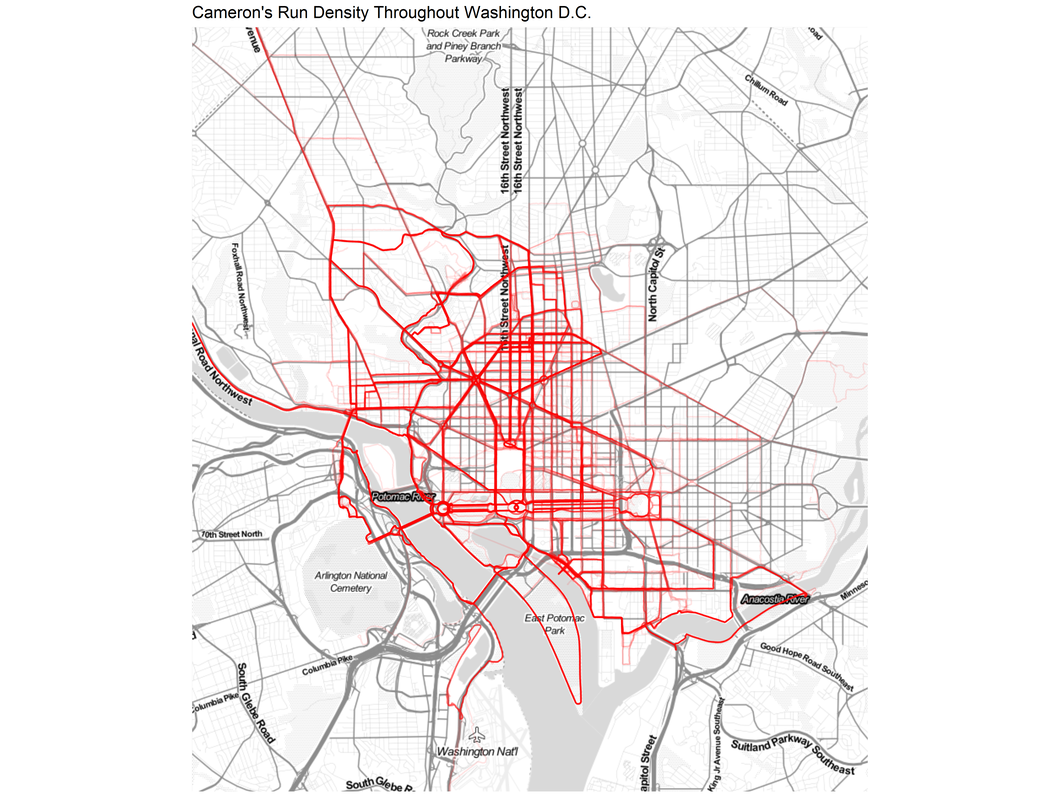 This version of the map features a larger geographic area to capture some of the more adventurous runs that I have taken to places like the National Arboretum, the C&O Trail, and down past DCA airport. The highest densities of runs are along the main streets around downtown, Dupont Circle, and the National Mall. Rosslyn and south of the airport were two areas that I wanted to explore more in my 2020 post, both of which show up in darker red on this new figure. To complement the geographic distribution of runs is a visual distribution of average pace vs. run distance. This was a challenge to analyze because the data and dates were downloaded in Spanish (don’t ask), but eventually I was able to plot each of the 798 (!) DC-based runs over the past five years. The runs in 2023 are highlighted in red. 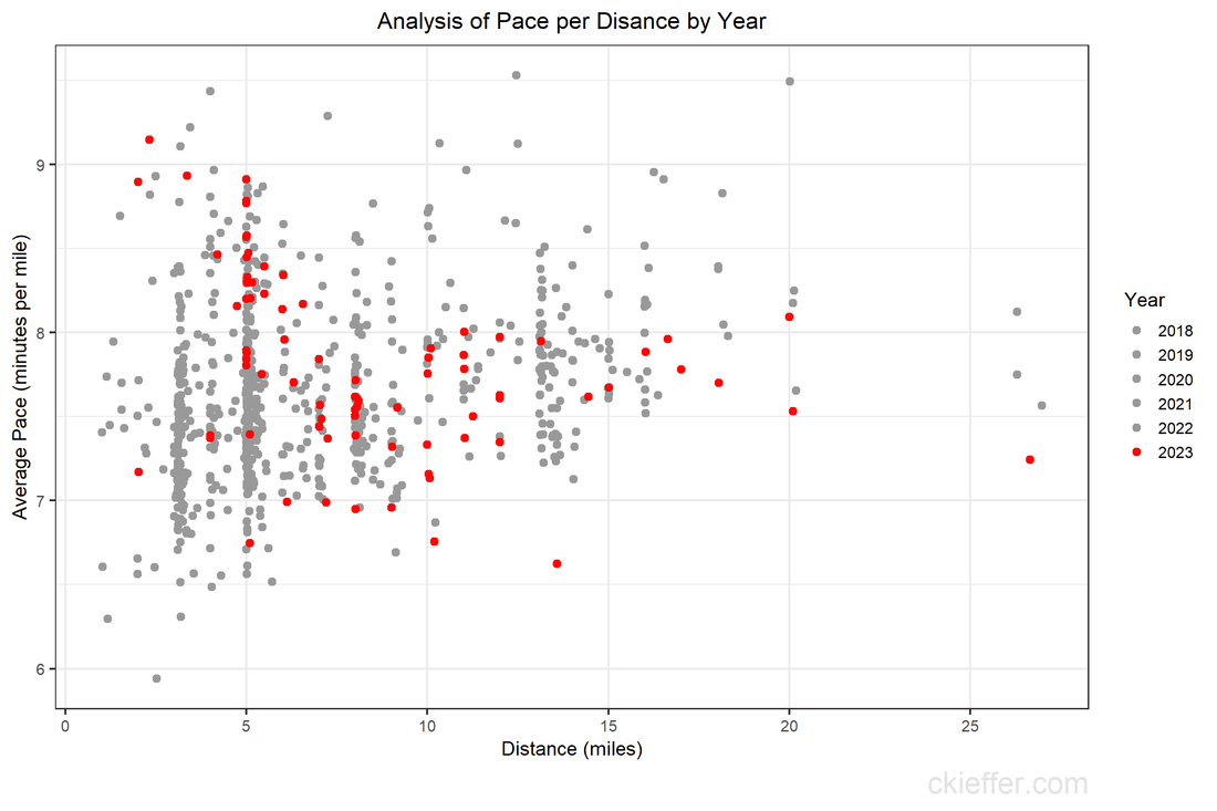 Luckily, the analysis reveals that many of the fastest runs for each distance are in the past 6 months. Progress! My rededication to running at a more relaxed pace for my five mile recovery runs is also visible. The next step is to fill in the space this figure with red dots for the rest of 2023 with the ultimate goal of placing a new dot in the bottom right corner by 2024. Wish me luck.
Back in January of 2020, when I was a brand-new AAAS Science and Technology Policy Fellow (STPF), I wrote a blog post centered around a plot of the history of the STPF. That figure contained data from all the way back in 1973 through 2019. Today’s post is an updated revisit to that post using the most recent trends in the fellowship. If you’re curious about the history of the AAAS STPF, I recommend checking out this timeline on their website and revisiting the previous version of this figure. Here’s the updated figure: 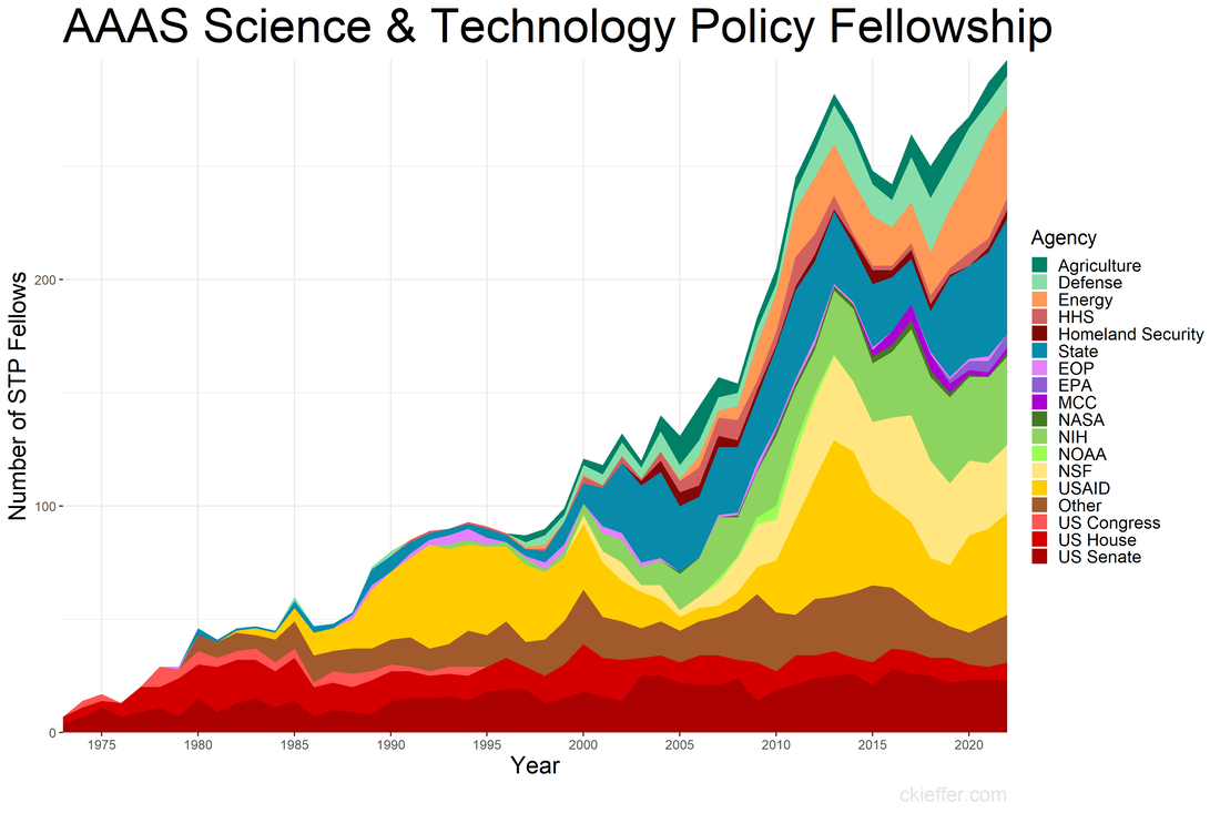 One major event has happened since the last update: the COVID-19 pandemic. This has not appeared to have had a dramatic affect on the trends in 2020 or after. In fact, the fellowship has recovered well following the pandemic with a record high number of fellows in 2022 (297). This was driven in part by increases in the number of fellows at State, USAID, and in “Other” agencies in the past three years. Since the previous analysis, three new agencies have received fellows for the first time: the Department of the Treasury, the Architect of the Capitol, and AAAS itself.
The AAAS STPF appears to be on an upward and healthy trajectory, unhindered by the global pandemic or any of our other global crises. One former fellow asked to comment on the updated figure said, "it shows the continued importance of science that drives solutions to global crises." Well said. Coda: This is a quick post to update the trends. If nothing else, it keeps my R skills up to date and gives the new fellows the lay of the land. Since that original post, I've written two other AAAS STPF-themed posts on placement office retention and my own knowledge gained through the fellowship. Check those out to learn more about the fellowship. “Can you teach an old scientist new tricks?” is a question that you have likely never asked yourself. But if you think about it, presumably, scientists should be adept at absorbing new information and then adjusting their world view accordingly. However, does that hold for non-science topics such as federal policy making? More and more the United States needs scientists who have non-science skills in order to make tangible advancements on topics such as climate change, space exploration, biological weapons, and the opioid crisis. The American Association for the Advancement of Science (AAAS) Science and Technology Policy Fellowship (STPF) helps to meet that need for scientists in government as well as to teach scientists the skills they need to succeed in policymaking. As the United States’ preeminent science policy fellowship, the AAAS STPF places doctoral-level scientists in the federal government to increase evidence-informed practices across government. In 2019, the program placed 268 scientists in 21 different federal agencies. Beyond simply lending some brilliant brains to the government, the AAAS STPF is a professional development program meant to benefit the scientist as much as the hosting agency. In addition to hands-on experience in government, fellows create individual development plans, attend professional development programming, start affinity groups, and spend program development funds. As part of its monitoring and evaluation of the learning in their program, AAAS sends out a biannual survey—that is, two times per year—to fellows to monitor changes in knowledge and ability, among other things. Now, as a spoiler, I was a AAAS STPF from 2019-2021 and I am sharing some of my survey results below, presented in the most compelling data visual medium—screenshots of spreadsheets. Each of the four columns represents on of the biannual surveys. Let's see how much I learned: 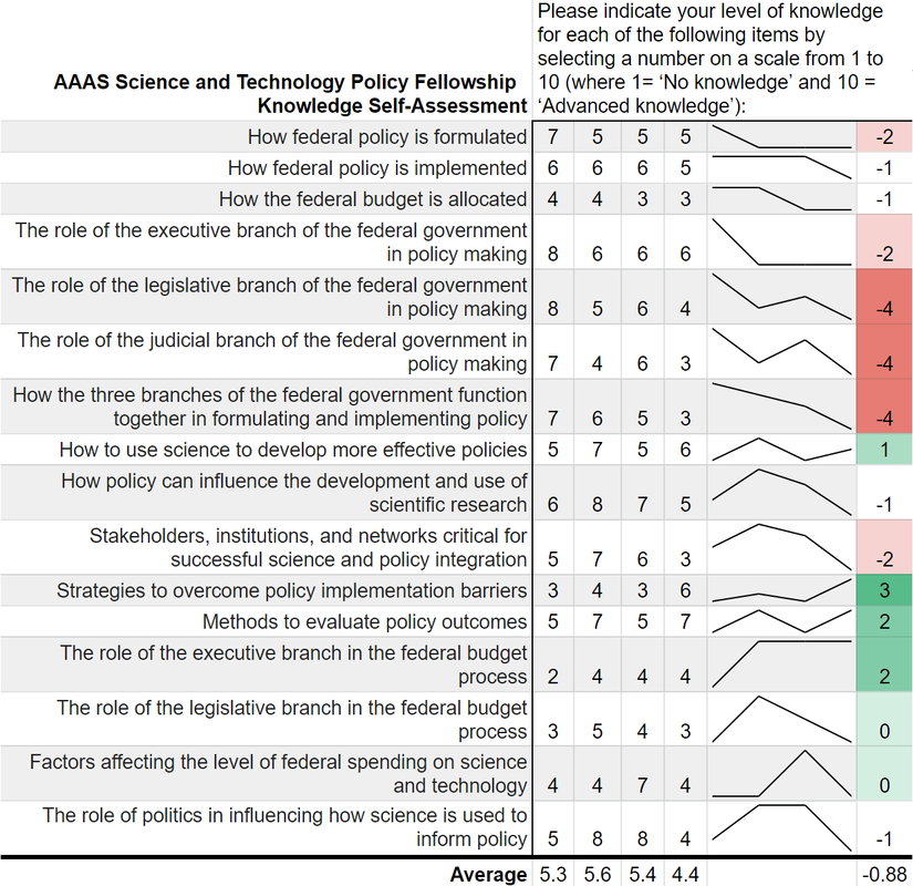 Um, where is the learning? Starting with my knowledge self-assessment, the outcomes are, at first blush, resoundingly negative. The average scores were lowest in the final evaluation of my fellowship (4.4 points) with an average fellowship-long change of -0.88 points. I was particularly bullish on my confidence in understanding each branch’s contribution policy making at the beginning of the fellowship and incredibly unsure of how policy was made at the close of the fellowship. There is however, one positive cluster of green boxes. These seem to focus more on learning about the budget, which I initially knew nothing about. Also, the positive items—with terms like “strategies” and “methods”--are more tangible and action focused. This would seem to support the value of the hands on experience compared to some of the more abstract concepts of how the government at large works. While not a glowing assessment of the program, let’s move on to the ability self-assessment… 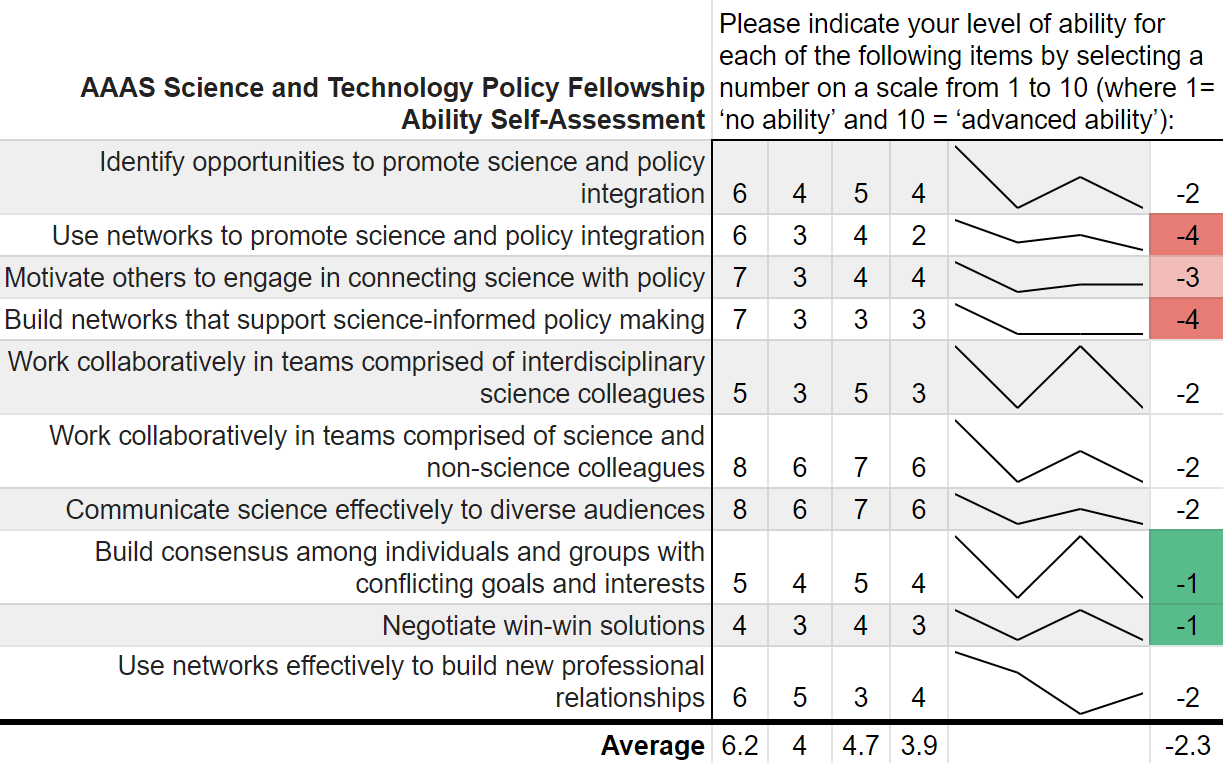 Yikes; that's even worse! There isn’t a single positive score differential on my ability self-assessment across the two years. Did I truly learn nothing? While the knowledge self-assessment had a small average point decline across the two years of the fellowship (0.9 points), the ability self-assessment had a larger average decline of 2.3 points. This decline was largest in my perceived ability to use and build networks. The working hypothesis to explain this discrepancy is, what else, the COVID-19 global pandemic. This dramatically reduced the ability to meet in groups and collaborate, something that many of these ability questions focus on. My responses here also had more noise and fewer clear trends compared to the knowledge self-assessment.
While COVID-19 likely played some role, both parts of the survey suffer from a pronounced Dunning-Kruger effect. Before the program I read the news, had taken AP Government, and had seen SchoolHouse Rock. Apparently, I thought that was sufficient to make me well-informed. This was a bold opinion considering that I was not 100% sure what the State Department did. After some practical experience in government, I slowly understood the complexities of the interconnected systems. Rather, I should say that I did not understand the labyrinthine bureaucracies, but at least began to appreciate their magnitude. That appreciation is what contributed to the decrease in survey scores over time. Not a lack of learning, but instead the learning of hidden truths juxtaposed with my initial ignorance. Despite these survey data, the AAAS STPF has taught me a tremendous amount about the federal government, policy making, and science’s role in that process. The first question on the survey is “Overall, how satisfied are you with your experience as a AAAS Science & Technology Policy fellow?” which I consistently rated as “Very Satisfied.” Increasingly, more and more fellows are remaining in the same office for a second year, indicating a high level of program satisfaction. The number reupping now sits around 70%. Finally, this is only a single data point from me. I did not ask AAAS for their data, but I have a sneaking suspicion that would be reluctant to part with it. Therefore, it is possible that no other fellows have this problem. Every other fellow is completely clear eyed and knows the truth about both themselves and the U.S. government. But if that was the case, then we wouldn’t need the AAAS STPF at all. I am glad that I learned what I didn’t know. Now I am off to learn my next trick. In these “strange times,” running has become a lifeline to the outdoors. It is one of the few legitimate excuses to venture outside of my efficiently-sized apartment. I started running in graduate school to manage stress and, even as my physical body continues to deteriorate, I continue to use running to shore up my mental stability. As the severity of the COVID-19 situation raises the stress floor across the nation, maintaining--or even developing--a simple running routine is restorative. I use the Strava phone app to track my runs. This app records times and distance traveled which is posted to a social-media-esque timeline for others to see. I choose this app after very little market research, but it seems to function well most of the time and is popular enough that many of my friends also use it. My favorite feature of the app is the post-run map. At the end of each session, it shows a little map collected via GPS coordinates throughout my jog. This feature is not without its flaws. In 2018, Strava published a heatmap of all its users’ data, which included routes mapping overseas US military bases. Publishing your current location data is a huge operational security (OPSEC) violation. Strangers could easily identify your common routes and even get a good idea of where you live. I recommend updating your privacy settings to only show runs to confirmed friends. With all that said, I wanted to create my own OPSEC-violating heatmap. Essentially, can I plot all of the routes that I have run in the past 18 months on a single map? Yes! Thanks to the regulations in Europe’s GDPR, many apps have made all your data available to you, the person who actually created the data. This includes Strava, which allows you to export your entire account. It is your data so you should have access to it. If you use Strava, it is simple to download all of your information. Just login to your account via a web browser, go to settings, then my account, and, under “Download or Delete Your Account,” select “Get Started.” Strava will email you a .zip folder with all of your information. This folder is chock full of all kinds of goodies, but the real nuggets are in the “activities” folder. Here you will find a list of files with 10-digit names, each one representing an activity. You did all of these! These files are stored in the GPS Exchange (GPX) file format, which tracks your run as a sequence of points. The latitude and longitude points are coupled with both the time and elevation at that point. Strava uses this raw information to calculate all your run statistics! With this data an enterprising young developer could make their own run-tracking application. But that’s not me. Instead, I am doing much simpler: plotting the routes simultaneously on a single map. Here is what that looks like: 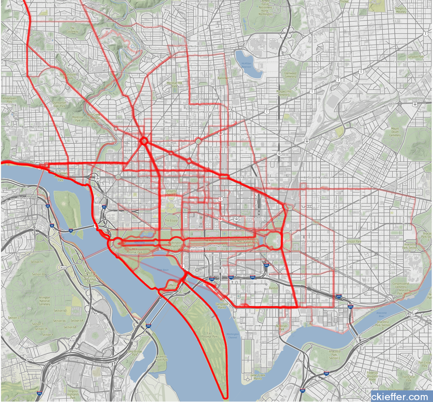 Again, this is a huge OPSEC violation so please do not be creepy. However, the routes are repetitive enough that it is not too revealing. Each red line represents a route that I ran. Each line is 80% transparent, so lighter pink lines were run less frequently than darker red lines. You can see that I run through East Potomac Park frequently. Massachusetts Avenue is a huge thoroughfare as well. I focused the map on the downtown Washington D.C. area. I used the SP and OpenStreetMap packages in R for plotting.
The well-tread paths on the map are not really surprising, but it does give me some ideas for ways to expand my route repertoire. My runs are centered tightly around the National Mall. I need to give SW and NE DC a little more love. I should also do some runs in Rosslyn (but the hills) or try to head south towards the airport on the Virginia side of the river. What did we learn from this exercise? Very little. This is an example of using a person’s own available data. What other websites also allow total data downloads? How can that data be visualized? Make yourself aware of where your data exists in the digital world and, if you can, use that data to learn something about your real world. My R code is available on GitHub. Note: Eagle-eyed readers may be able to identify a route where I walked across water. Is this an error or am I the second-coming? Who can say? Since 1973, the American Association for the Advancement of Science (AAAS) has facilitated the Science & Technology Policy fellowship (STPF). The goal of the program is to infuse scientific thinking into the political decision making process, as well as developing a workforce that is knowledgeable in both policymaking and science. Intuitively, it makes sense to place evidence-focused scientists in the government to support key decisions makers. Each year doctoral-level scientists are placed throughout the federal government for one to two year fellowships. Initially the program placed scientists exclusively in the Legislative branch, but as the program grew, placements in the Executive branch became more common. In 2019, hundreds of scientists were placed in 21 different agencies throughout the federal government. As one of those fellows, I wanted to create a Microsoft Excel-based directory of current fellows. However, what began as a project to develop a simple CSV file turned into a visual exploration of the historic and current composition of the AAAS STPF program. Below are some of my observations. Data was collected from the publicly available Fellow Directory. 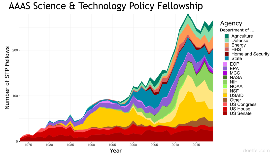 In the beginning of the STPF program, 100% of fellows were placed in the Legislative Branch. This continued until the first Executive branch fellows around 1980 were placed in the State Department, Executive Office of the President (EOP), and the Environmental Protection Agency (EPA). In 1986, the number of Executive Branch fellows overtook the number of Legislative Branch Fellows for the first time. Since those initial Executive Branch placements, fellows have found homes in 43 different organizations. The U.S. Senate has had the largest total number of fellows while the U.S. Agency for International Development (USAID) is the Executive Branch agency that has had the most placements. Unfortunately, for the clarity of the figure, agencies with fewer than twenty total fellow placements were grouped into a single "other" category. Despite the mundane label, this category represents strength and diversity of the AAAS STPF. The "other" category encompasses 25 different agencies including the Bureau of Labor Statistics, the World Bank, the Bill and Melinda Gates Foundation, and the RAND Corporation. In 2017, fellows were placed in 24 different organizations, the most diverse of any year. The total number of fellows has dramatically increased over the past 45 years (as seen in the grey bar plot at the bottom of the figure). The initial cohort of congressional fellows in 1973 had just seven enterprising scientists. Compare that to 2013 when a total of 282 fellows were selected and placed. This year (2019) tied 2014 for the second highest number of placements with 268 fellows. One of the most striking observations is the trends in placement at USAID. In 1982 USAID began to sponsor AAAS Executive Branch fellows, with one placement. Placements at USAID quickly grew, ballooning to over 50% of total fellow placements in 1992. However, just as rapidly, the placement fraction at USAID decreased during the 2000s despite only a small increase in the overall number of fellows. This trend ultimately began to reverse in 2010, and a large increase in the total number of fellows found placement opportunities at USAID. The reader is left to craft their own explanatory narrative. One thing is clear from the data: the AAAS STPF is as strong as it has ever been. Placement numbers are close to all-time highs and fellows are represented at a robust number of agencies. Only time will tell if the experience these fellows gain will help them achieve the program's mission "to develop and execute solutions to address societal challenges." If you want to learn more about the history of the STPF, including statistics for each class, AAAS has an interactive timeline on their website. An unexpected surprise during the analysis was the discovery that Dr. Rodney McKay and John Sheppard (both of Stargate Atlantis fame) were STP fellows. Or--more likely--the developer for the Fellows Directory was a fan of the show. Unfortunately, as a Canadian citizen, Dr. McKay would be ineligible for the AAAS STPF. 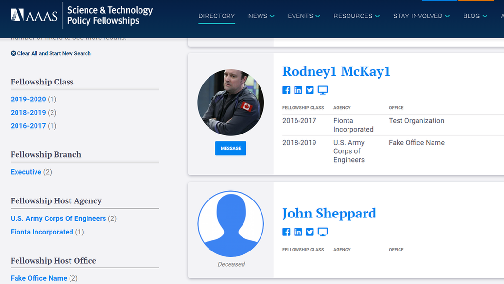 Recently at brunch someone made a statement about there being only one person with a PhD in the US House of Representatives. This did not seem probable to me and after some Googling, I found that the House Library conveniently maintains a list of doctoral degree holders in the 116th House. 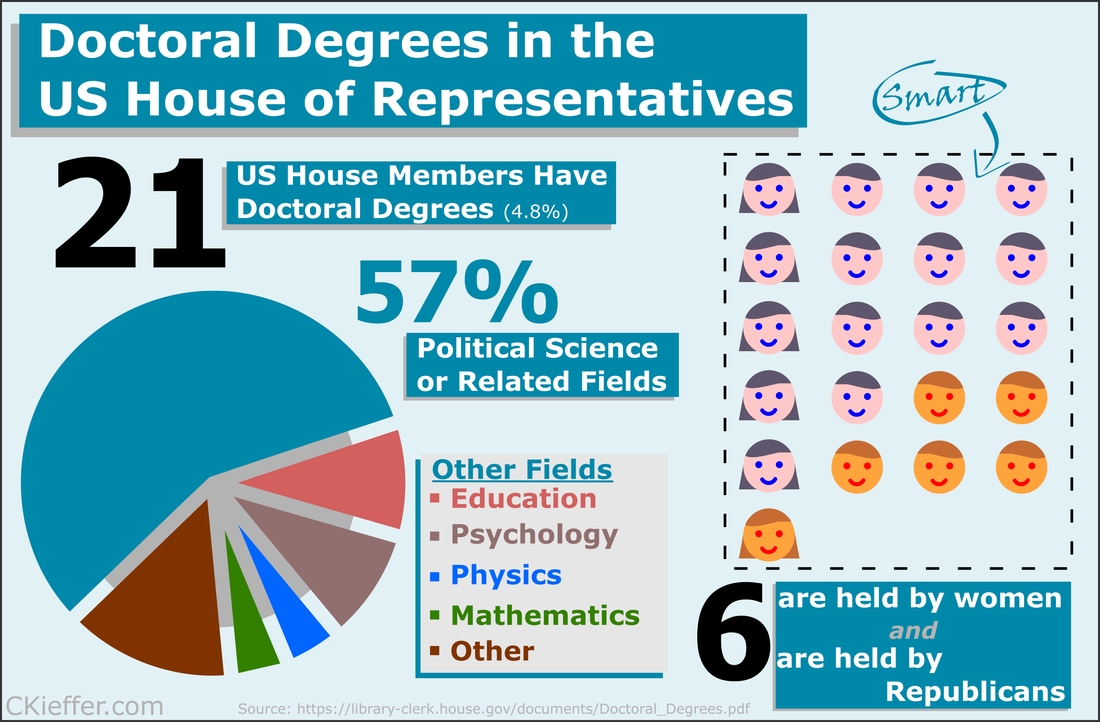 Though there is only one hard science PhD in the house (Bill Foster, D-IL; Physics), there are also other STEM doctorate holders in the House including two psychologists, a mathematician, and a monogastric nutritionist. There are also obviously quite a few other doctorate holders, most of which are in political science (obviously), but also a Doctor of Ministry from Alabama (Guess the political party!).
Overall 21 is a small fraction of the House (only 4.8%), especially compared to the 157 members that are lawyers. Given the wide-reaching and technical nature of the government and the laws that regulate it, it may be advantageous to increase the number of scientists represented in Congress. While that is a decision ultimately for each state's voters, there are a number of programs aimed at increasing the involvement of scientists in government policy. As an infographic making exercise I would consider this a mixed success. I think it conveys the information effectively, but lacks a certain je ne sai quoi in the aesthetics department. My little emoji heads especially could use some work. Any graphic designers out there please reach out with tips. The House Library maintains lists of lawyers, military service members, medical professionals, as well as other specialties in their membership profile. I am going to download these lists as a baseline for the analysis of future Congresses. 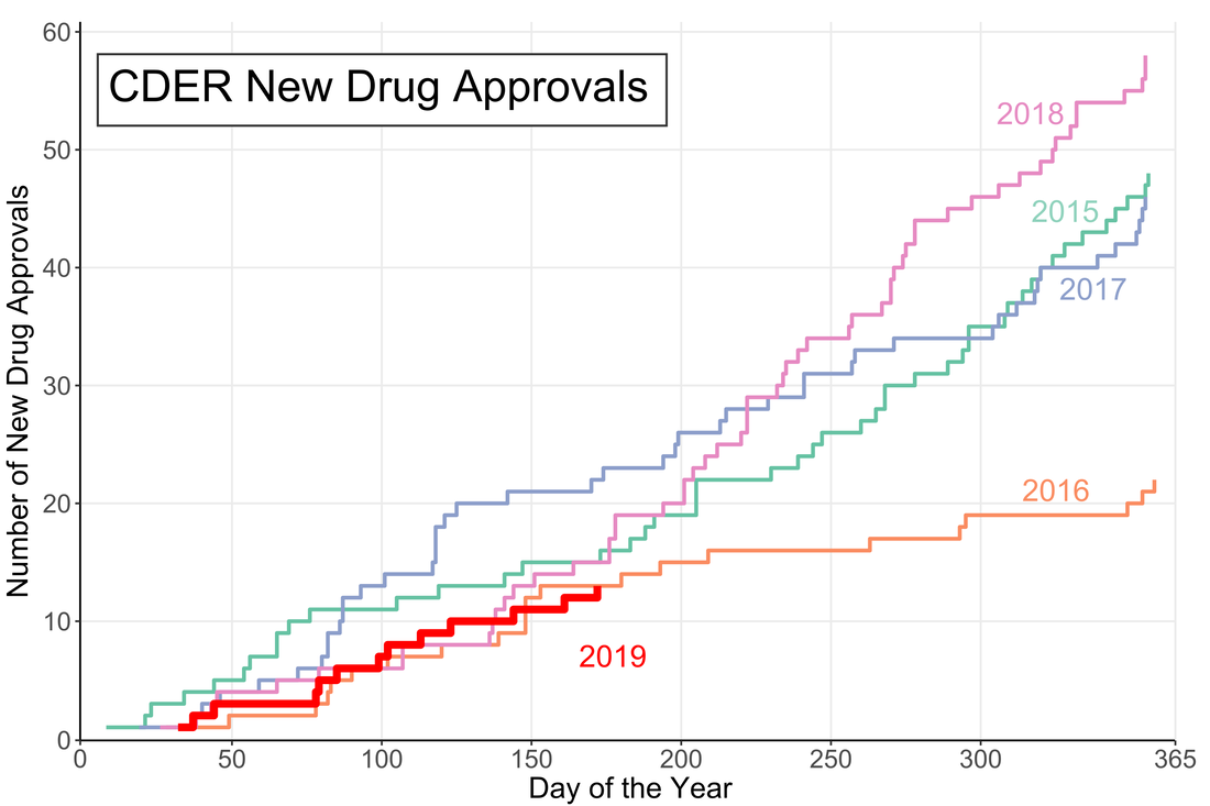 A little over halfway through the year and the US Food and Drug Administration (FDA) appears to be on track for either a big year of new drug approvals or....not. The number of new molecular entities (NMEs) approved by FDA's Center for Drug Evaluation and Research (CDER) are equal to the number approved at this point of the year in 2016 and only two product apporvals behind both 2018 and 2015. Despite starting the year off with the longest federal shutdown in history the FDA is keeping pace with past years.
However, the figure demonstrates another important fact: approval numbers mid-year do not correlate strongly with year-end approvals. While the number of approvals were similar in 2016 and 2018, the end year totals were wildly different. In 2018, CDER approved a record 59 NMEs while 2016 approved less than half of that number. Additionally, in 2017, the number of NME approvals at mid-year was much higher than any other year, but finished in line with the number of approvals in 2015 and well below the number of approvals in 2018. It seems that the future could go either way. There could be a dramatic up-tic in CDER approval rate as in 2018 (perhaps from shutdown-delayed applications) or the rate could slow to a crawl like in 2016. Remember Super Bowl LI you guys? It happened, at minimum, five days ago and of course Tom Brady won what was actually one of the best Super Bowls in recent memory. Football, however, is only one half of the Super Bowl Sunday coin. The other half are the 60 second celebrations of capitalism: the Super Bowl Commercials. Everyone has a list of favorites. Forbes has a list. Cracked has a video. But it is no longer politically correct in this Great country to hand out participation trophies, someone needs to decide who actually won the Advertisement Game. To tackle (AHAHA) this question I turned to the infinite online data repository, Google Trends, which tracks online search traffic. Using a list of commercials compiled during the game (AKA I got zero bathroom breaks) I downloaded the relative search volume in the United States for each company/product relative to the first commercial I saw for Google Home. [Author’s note: Only commercials shown in Nebraska, before the 4th quarter when my stream was cut, are included]. Here’s an example of what that looked like: 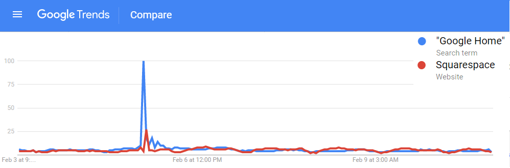 !The search traffic for a product instantly increased when a commercial was shown! You can see exactly in which hour a commercial was shown based on the traffic spike. Using the traffic spike as ground zero, I added up search traffic 24 hours prior to and after the commercial to see if the ad significantly increased the public’s interest in the product. Below is a plot of each commercial, with the percent of search traffic after the commercial on the vertical axis and the highest peak search volume on the horizontal. If you look closely you will see that some of them are labeled. If a point is below the dotted line the product had less search traffic after the commercial than before (not good). 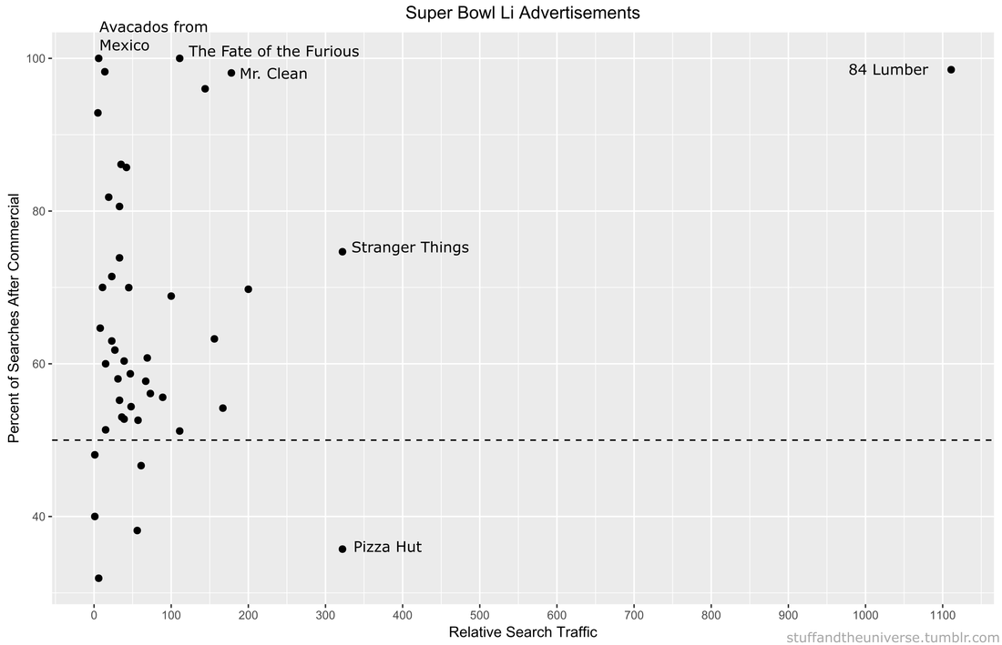 On average 86% of products had more traffic after their Super Bowl ad than before it. But there are no participation trophies in the world of marketing and the clear winner is 84 Lumber. Damn. They are really in a league of their own (another sports reference!). Almost no one was searching for them before the Super Bowl but oh boy was everyone searching for them afterwards. They used the ole only-show-half-of-a-commercial trick where you need to see what happens next but can only do that by going to their website. Turns out its a construction supplies company
Pizza Hut had a pretty large spike during their commercial, but it actually was not their largest search volume of the night. Turns out most people are searching for pizza BEFORE the Super Bowl. Stranger Things 2 also drew a lot of searches for obvious reason. We all love making small children face existential Lovecraftian horrors. Other people loved the tightly-clad white knight Mr. Clean and his sensual mopping moves. The Fate of the Furious commercial drew lots of searches, most likely of people trying to decipher WTF the plot is about. Finally there was the lovable Avocados from Mexico commercial. No one was searching for Avocados from Mexico before the Super Bowl, but now, like, a couple of people are searching for them. Win. So congratulations 84 Lumber on your victory in the Advertisement Game. I’m sure this will set a dangerous precedent for the half-ads in Super Bowl LII. It’s possible to find play-by-play win probability graphs for every NFL game, but that does not tell me much about how the game itself was played. Additionally, I only sporadically have time to actually WATCH a game so using play-by-play data, R, and Inkscape I threw together this visualization of every play in this past Sunday’s game between the Kansas City Chiefs and New Orleans Saints. Why isn’t this done more often? 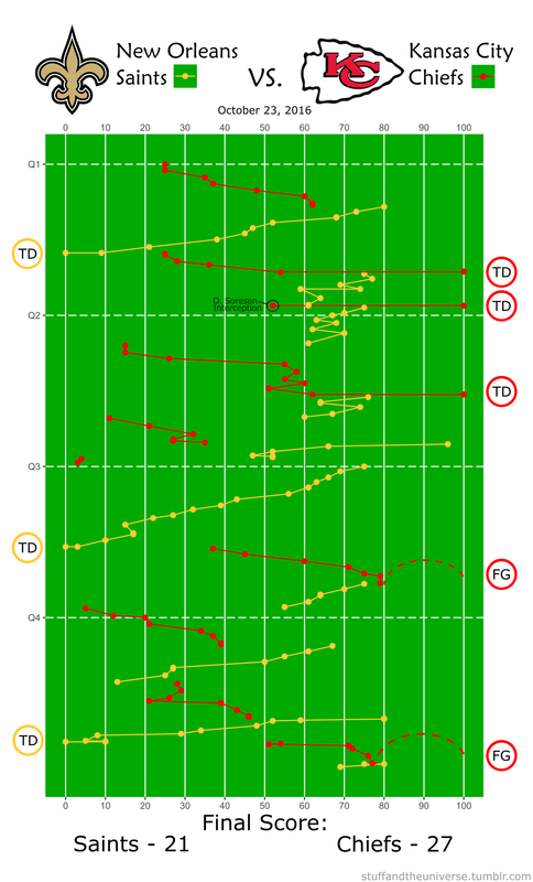 |
Archives
July 2023
Categories
All
|
 RSS Feed