It is always interesting when you look at this planet of ours in a new way! Did anything surprise you in the figure?
0 Comments
In these “strange times,” running has become a lifeline to the outdoors. It is one of the few legitimate excuses to venture outside of my efficiently-sized apartment. I started running in graduate school to manage stress and, even as my physical body continues to deteriorate, I continue to use running to shore up my mental stability. As the severity of the COVID-19 situation raises the stress floor across the nation, maintaining--or even developing--a simple running routine is restorative. I use the Strava phone app to track my runs. This app records times and distance traveled which is posted to a social-media-esque timeline for others to see. I choose this app after very little market research, but it seems to function well most of the time and is popular enough that many of my friends also use it. My favorite feature of the app is the post-run map. At the end of each session, it shows a little map collected via GPS coordinates throughout my jog. This feature is not without its flaws. In 2018, Strava published a heatmap of all its users’ data, which included routes mapping overseas US military bases. Publishing your current location data is a huge operational security (OPSEC) violation. Strangers could easily identify your common routes and even get a good idea of where you live. I recommend updating your privacy settings to only show runs to confirmed friends. With all that said, I wanted to create my own OPSEC-violating heatmap. Essentially, can I plot all of the routes that I have run in the past 18 months on a single map? Yes! Thanks to the regulations in Europe’s GDPR, many apps have made all your data available to you, the person who actually created the data. This includes Strava, which allows you to export your entire account. It is your data so you should have access to it. If you use Strava, it is simple to download all of your information. Just login to your account via a web browser, go to settings, then my account, and, under “Download or Delete Your Account,” select “Get Started.” Strava will email you a .zip folder with all of your information. This folder is chock full of all kinds of goodies, but the real nuggets are in the “activities” folder. Here you will find a list of files with 10-digit names, each one representing an activity. You did all of these! These files are stored in the GPS Exchange (GPX) file format, which tracks your run as a sequence of points. The latitude and longitude points are coupled with both the time and elevation at that point. Strava uses this raw information to calculate all your run statistics! With this data an enterprising young developer could make their own run-tracking application. But that’s not me. Instead, I am doing much simpler: plotting the routes simultaneously on a single map. Here is what that looks like: 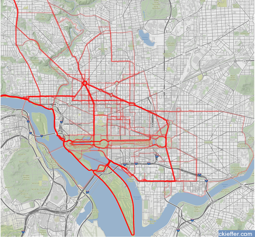 Again, this is a huge OPSEC violation so please do not be creepy. However, the routes are repetitive enough that it is not too revealing. Each red line represents a route that I ran. Each line is 80% transparent, so lighter pink lines were run less frequently than darker red lines. You can see that I run through East Potomac Park frequently. Massachusetts Avenue is a huge thoroughfare as well. I focused the map on the downtown Washington D.C. area. I used the SP and OpenStreetMap packages in R for plotting.
The well-tread paths on the map are not really surprising, but it does give me some ideas for ways to expand my route repertoire. My runs are centered tightly around the National Mall. I need to give SW and NE DC a little more love. I should also do some runs in Rosslyn (but the hills) or try to head south towards the airport on the Virginia side of the river. What did we learn from this exercise? Very little. This is an example of using a person’s own available data. What other websites also allow total data downloads? How can that data be visualized? Make yourself aware of where your data exists in the digital world and, if you can, use that data to learn something about your real world. My R code is available on GitHub. Note: Eagle-eyed readers may be able to identify a route where I walked across water. Is this an error or am I the second-coming? Who can say? I know what you are all thinking: which state has the most beautiful college-aged women? A question for the ages to be sure, one that if I ask again in a few years would probably end with me in jail. Total Frat Move has been faithfully performing the Lord’s work and compiling a database answering that very question. TFM’s ‘Instagram Babe of the Day’ showcases one Instagram account featuring a woman wearing clothes that her father must...just...not know about. Using the tools at Kimono Labs I assembled a list of 299 IBoDs and sorted them by state. Here are the results in a fraternity-approved-salmon colored map: 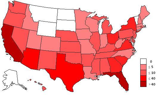 Florida is the winner and it is not even close at 67 ‘Babes’ of the 299, or 22%. California is the next closest at 49 followed by Arizona at 38, Texas at 21 and then Virginia and New York with 8 and 7 respectively. In fact together the top 3 states beat out the bottom 48 (including DC) combined. The entire country of Australia had 1 which puts it ahead of the six states with zero. America’s friendly neighbor to the North, Canada, came in at 4 beating out 34 states. Clearly not all states are equally gifted. Warmer states seem to be dominating and the upper portion of the Midwest is just a deserted wasteland. But Wyoming only has 6 people per square mile. I didn’t expect there to be bronze bombshells patrolling the streets of Cheyenne. But even adjusting for the number of female college students per state does not even the playing field. Here is a graph of the total number of IBoDs plotted against female college students by state (data are in thousands, from 2008; available at the US Census. Thanks Obama). 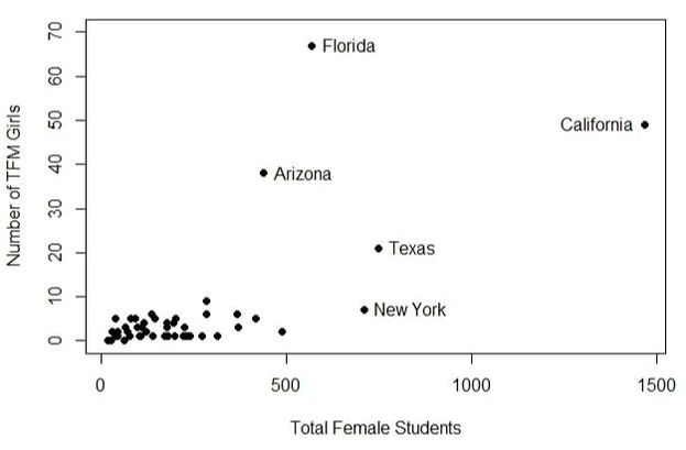 Florida and Arizona are really just doing a great job. Keep it up gals. Texas and especially New York are under-performing their potential. Both have fewer TFM ‘Babes’ than would be expected based on their student population. Hawaii, with its low student population, actually has the highest rate of IBoDs. Around 1 in every 8500 college girls is on TFM. Florida’s rate is the only close competition at 1:9000 followed by a distant Arizona. Babes of the Day is only one metric though. Is it really accurate in predicting the most beautiful states? I looked up some other rankings and chose two (the first two that came up on Google). The first was from the internet’s bastion of journalism, Buzzfeed, and the other was from Comcast Xfinity (even they have lists?). Both used a combination of arbitrary numbers to reach their equally dubious conclusions about the most attractive states. Here are the top 5 for each in descending order. (I switched back to using total number of IBoDs for this one because it gives a better list. Rigor is not the goal of this analysis) 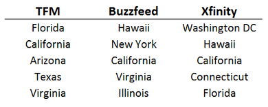 No surprise, California shows up on each list. We also see Florida and Virginia show up on one of the other lists. The other two lists have Hawaii which would have been there if we had taken into account total number of college girls. So overall 3 of our top 5 ended up on the other lists which gives us a 60%. Plus 10% extra credit for Hawaii almost being on there gives us 70%. And C’s get degrees.
There is no way to differentiate between correlation and causation. Either warm weather attracts beautiful women, makes women beautiful or coerces them to send their names to TFMintern@grandex.co. Who cares though? I’m not complaining. |
Archives
July 2023
Categories
All
|
 RSS Feed