|
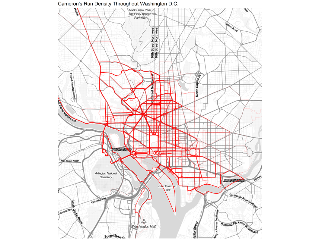
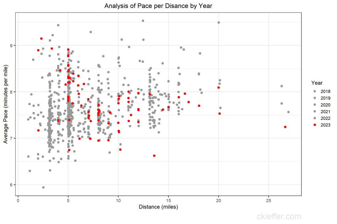
During the height of the COVID-19 pandemic, everyone was trapped indoors. Various jurisdictions had different policies on appropriate justifications for venturing outside. I vividly remember the DC National Guard being deployed to manage the flow of people into the nearby fish market. However, throughout the pandemic, outdoor and socially distant running or exercising was generally allowed. Because the gyms were closed and the outdoors were open, my miles run per week shot up dramatically. I even wrote a blog post about it in April 2020. Now the pandemic has subsided, but I the running has not. In fact, I’m running more than ever in a hunt for a Boston Marathon qualifying time. During this expanded training, and throughout the past three years, I have run many of the local DC streets. I have updated the running heatmap that I published in 2020 after several thousand additional miles in the District. I’ve been told the premium version of the Strava run tracking phone app will make a similar map for you. This data did come from Strava, but I’ve created my own map on the cheap using a pinch of guile (read: R and Excel). This version of the map features a larger geographic area to capture some of the more adventurous runs that I have taken to places like the National Arboretum, the C&O Trail, and down past DCA airport. The highest densities of runs are along the main streets around downtown, Dupont Circle, and the National Mall. Rosslyn and south of the airport were two areas that I wanted to explore more in my 2020 post, both of which show up in darker red on this new figure. To complement the geographic distribution of runs is a visual distribution of average pace vs. run distance. This was a challenge to analyze because the data and dates were downloaded in Spanish (don’t ask), but eventually I was able to plot each of the 798 (!) DC-based runs over the past five years. The runs in 2023 are highlighted in red. Luckily, the analysis reveals that many of the fastest runs for each distance are in the past 6 months. Progress! My rededication to running at a more relaxed pace for my five mile recovery runs is also visible. The next step is to fill in the space this figure with red dots for the rest of 2023 with the ultimate goal of placing a new dot in the bottom right corner by 2024. Wish me luck.
0 Comments
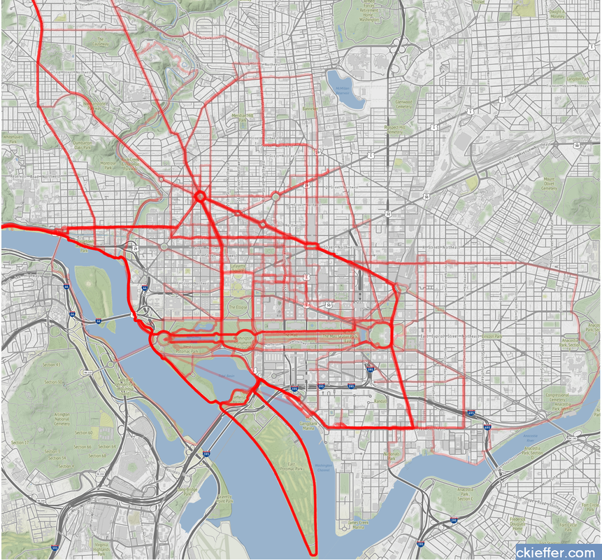
In these “strange times,” running has become a lifeline to the outdoors. It is one of the few legitimate excuses to venture outside of my efficiently-sized apartment. I started running in graduate school to manage stress and, even as my physical body continues to deteriorate, I continue to use running to shore up my mental stability. As the severity of the COVID-19 situation raises the stress floor across the nation, maintaining--or even developing--a simple running routine is restorative. I use the Strava phone app to track my runs. This app records times and distance traveled which is posted to a social-media-esque timeline for others to see. I choose this app after very little market research, but it seems to function well most of the time and is popular enough that many of my friends also use it. My favorite feature of the app is the post-run map. At the end of each session, it shows a little map collected via GPS coordinates throughout my jog. This feature is not without its flaws. In 2018, Strava published a heatmap of all its users’ data, which included routes mapping overseas US military bases. Publishing your current location data is a huge operational security (OPSEC) violation. Strangers could easily identify your common routes and even get a good idea of where you live. I recommend updating your privacy settings to only show runs to confirmed friends. With all that said, I wanted to create my own OPSEC-violating heatmap. Essentially, can I plot all of the routes that I have run in the past 18 months on a single map? Yes! Thanks to the regulations in Europe’s GDPR, many apps have made all your data available to you, the person who actually created the data. This includes Strava, which allows you to export your entire account. It is your data so you should have access to it. If you use Strava, it is simple to download all of your information. Just login to your account via a web browser, go to settings, then my account, and, under “Download or Delete Your Account,” select “Get Started.” Strava will email you a .zip folder with all of your information. This folder is chock full of all kinds of goodies, but the real nuggets are in the “activities” folder. Here you will find a list of files with 10-digit names, each one representing an activity. You did all of these! These files are stored in the GPS Exchange (GPX) file format, which tracks your run as a sequence of points. The latitude and longitude points are coupled with both the time and elevation at that point. Strava uses this raw information to calculate all your run statistics! With this data an enterprising young developer could make their own run-tracking application. But that’s not me. Instead, I am doing much simpler: plotting the routes simultaneously on a single map. Here is what that looks like: Again, this is a huge OPSEC violation so please do not be creepy. However, the routes are repetitive enough that it is not too revealing. Each red line represents a route that I ran. Each line is 80% transparent, so lighter pink lines were run less frequently than darker red lines. You can see that I run through East Potomac Park frequently. Massachusetts Avenue is a huge thoroughfare as well. I focused the map on the downtown Washington D.C. area. I used the SP and OpenStreetMap packages in R for plotting.
The well-tread paths on the map are not really surprising, but it does give me some ideas for ways to expand my route repertoire. My runs are centered tightly around the National Mall. I need to give SW and NE DC a little more love. I should also do some runs in Rosslyn (but the hills) or try to head south towards the airport on the Virginia side of the river. What did we learn from this exercise? Very little. This is an example of using a person’s own available data. What other websites also allow total data downloads? How can that data be visualized? Make yourself aware of where your data exists in the digital world and, if you can, use that data to learn something about your real world. My R code is available on GitHub. Note: Eagle-eyed readers may be able to identify a route where I walked across water. Is this an error or am I the second-coming? Who can say? |
Archives
July 2023
Categories
All
|


 RSS Feed